A correlation matrix is another useful tool for the data analytics enthusiasts that can help you compare the correlation coefficients based on a number of predictor variables. These coefficients also provide an insight on the strength of the relationship of each variable with another. It could either be a positive (direct) or negative (indirect) correlation. As part of this tutorial, I am going to take you on another amazing journey of correlating different aspects by inspecting “trees” and “mtcars” datasets.
Firing up the Libraries
As always, we will start with installing the relevant packages and loading the libraries:
# Install Packages
install.packages(“tidyverse”)
install.packages(“caret”)
install.packages(“leaps”)
library(tidyverse)
library(caret)
library(leaps)
Once that is done, we are going to install two additional libraries as well for visualizing our correlation plots:
#Invoking Libraries for Better Corplot Visualization
library(ggplot2)
library(reshape2)
Exploring the Trees Dataset
The “trees” dataset is a built-in R dataset that has measurements of height, diameter, and volume of Black Cherry trees. First off, you should load the trees dataset by:
#Selecting Data
data(trees)
Once that is done, you can look for data integrity issues through head() and glimpse(). Once all you get the data checked, you are now ready for the data analysis. Let’s take a look at our data:
#Taking a look at Trees Dataset
head(trees)
Output:
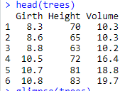
From the looks of it, you have three numeric variables that you might want to find the relationship.
Making a Correlation Matrix for Trees Dataset
Before proceeding towards creating your very own correlation matrix, there are a few things that can make you data more presentable. One of them is to use the melt() function which is a reshaping tool and should be used before running the cor() function. On the other hand, Cor() function is quite straight forward, you just have to use a dataset or dataframe for finding correlations between variables.
Let’s assign a dataframe:
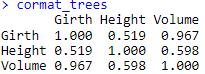
#Creating a Cor Matrix DF
cormat_trees <- cor(trees)
#Checking Cor Matrix
cormat_trees
Output:
Once it is done, let’s melt the correlation matrix dataframe:
# Melting the Cormat DF
cortree_melt <- melt(cormat_trees)
#Checking Melted DF
cortree_melt
Output:
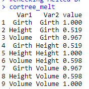
Now, you can easily compare what I was implying about the melt() function. The above-mentioned output after using the melt() function looks more presentable and can provide you far better insight of the correlation between two variables.
Plotting the Results using ggplot()
Once it is done, tabular data can be better visualized through plots. Here for better understanding, we are going to use another amazing feature called geomtile() that is basically a heat map for the correlation plot.
# Visualizing the Correlation Matrix
ggplot(data = cortree_melt,
aes(x=Var1, y = Var2, fill = value)) + geom_tile()
Output:
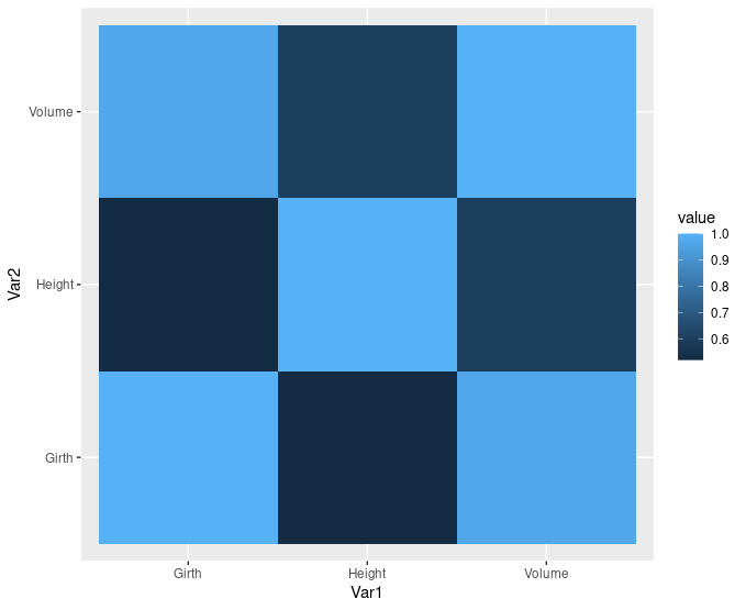
Isn’t that look amazing, let’s explore another dataset “mtcars”
Correlation Plot in “mtcars” Dataset
The mtcars datasets shows data on mileage of different cars based on a number of different variables like displacement (disp), gross horsepower(hp), weight (wt), and rear axle ratio (drat). For the sake of simplicity, we are going to take these four predictors.
#Taking another Dataset and Another Method
cor_new_model <- mtcars[, c(“disp”,”hp”,”wt”,”drat”)]
cor(cor_new_model)
Following output is displayed:
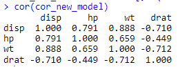
You might have noticed that we haven’t melted the dataframe this time. Well, if you are comfortable with a matrix display, you can also cor() function in its originality.
Visualizing the Results
Here, we are going to explore some more options to make your visualization more presentable. First, let’s use the corrplot() function:
# Using Corrplot Function
install.packages(“corrplot”)
library(“corrplot”)
corrplot(cor(cor_new_model), method = “circle”)
Following output is displayed:
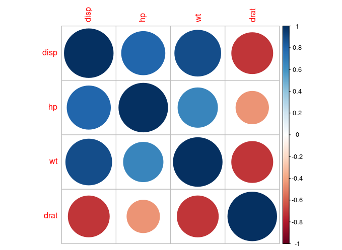
Looks amazing, right? Here, we have used the method called “circle” to define the intensity of correlation and can be interpreted using the scale on the right.
Another way is to use the ggcorplot() package:
#Another Tile Representation using ggcorrplot
install.packages(“ggcorrplot”)
library(“ggcorrplot”)
ggcorrplot(cor(cor_new_model))
Output:
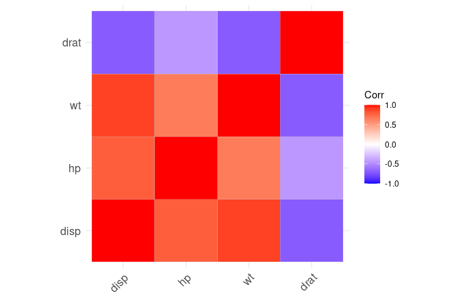
Here we have another heat-map plot based on correlation coefficient.
Parting Words
Correlation matrix and its visualization can greatly help data and machine learning enthusiasts in deducing dependency on variables on one another in a easy yet precise way. Mapping the correlation intensity in the form of tiles or circles are two of the most common options that can help you get a gist of to what extend the variables are dependent on each other. It can also help you drive valuable conclusions in your data analytics journey.
Going Deeper…
If you’d like to know more, you can find it out here:
Linear Modeling:
- How to Create Linear Model in R using lm Function
- Predict Function in R
- Stepping into the World of Stepwise Regression
Plotting in R: