Among the various packages I use on a daily basis, one stands out: ggplot2, the graphing package. This package is generally supported by the members of the “tidyverse” as their preferred plotting package. ggplot2 offers a great alternative to R’s base plotting functions. In this tutorial, I will introduce you to the capabilities of this package.
The tidyverse
As previously mentioned, ggplot2 belongs to what is known within the R community as the tidyverse. It is crucial to mention this before diving into the package, as ggplot2 is often accompanied in its use by other packages belonging to the tidyverse. These packages, in unison, adapt the same approach, philosophy, and understanding of how data should be dealt with.
The essence of this underlying approach lies in what is referred to as “tidy data” (see: Tidy Data by Hadley Wickham), which is a term coined and popularized by Hadley Wickham (see: http://hadley.nz/), most likely the biggest contributor to the R community. Hadlely Wickham also incidentally happens to have written the very package on which this tutorial is based. More specifically, ggplot2 was written with the purpose of incorporating the ideas expressed in The Grammar of Graphics by Leland Wilkinson. In any case, all of this is beyond the scope of this article. However, let it be known to those striving to become proficient data scientists that these topics undoubtedly require further study.
Not just programmers!
On last thing that should be noted is that ggplot2 may be a solution for you even if you are not a programmer. Why is that? As those who have worked with programs or software that rely on graphical user interfaces may easily attest to, visual programs are not always the most reliable. Whether this be Word, PowerPoint, or Excel, often one faces problems when the data grows too large. The program glitches, renders differently, crashes, or suffers some other type of malfunction. Reliability is crucial, therefore if you often require the rendering of plots, you might just find that codifying your plot as a ggplot2 object is as reliable as it gets. Even if this entails that the total extent of your involvement with R amounts to nothing more than importing your data and writing a line of ggplot2 code. Just as LaTeX is used as a reliable tool for the generation of complex formulas and symbols all encoded as plain text, so too may ggplot2 be used in a similar fashion but for plots.
With that, let’s get started.
This tutorial assumes familiarity with R and RStudio. Our preferred work environment is RStudio (see: https://rstudio.com/) and all the following code examples were written in it. Therefore, it is recommended that you run these codes on RStudio. Once in RStudio, let us open a new R Notebook.
All the examples in this tutorial may be run from a regular .R script as well. However, especially when we are working with data visualization and exploration, we prefer a Notebook so that we may run and see results for different “chunks” of our code on the same page. As stated above, familiarly with RStudio is assumed, therefore we will not be going into detail on how to use an R Notebook.
If you are not familiar with now to install and loaded packages in R, go learn that and get yourself a little familiar with R before continuing this tutorial. For the rest of you, the package we are concerned with here is officially called “ggplot2”. Go ahead and load it by running the following two lines in the console.
Since the primary focus of this tutorial is plotting using ggplot2, we will use a simple dataset, which will minimize our need for pre-processing the data. We choose the “iris” dataset (see: https://en.wikipedia.org/wiki/Iris_flower_data_set) which is an R built-in dataset and can easily be attained by running:
install.packages('ggplot2')
library(ggplot2)
data('iris')
Understanding ggplot2
Before going further, let us take a moment to understand how ggplot2 works. Unlike R’s base plotting functions, ggplot2 plots are saved as objects. Any plot is an object which is easily created using minimal information; namely, the data and variable mappings. After this is done, layers, scales, coords, and facets may be successively added to the object similar to how you would add numbers in a mathematical formula. These layers contain any further information required to plot that data. Everything will be made clear in the following example.
Let’s plot!
To create the initial object, all you need to run is the ggplot function:
ggplot(iris, aes( x = Sepal.Length, y = Sepal.Width))There are two things we are doing here. First, we are supplying the data that we intend to plot. Second, we are providing an aesthetic mapping (aes()), which is mapping the variables we choose from our dataset to the variables of the plot. In this case, we chose to map the variable Sepal.Length in our iris dataset to the variable x in our plot, and Sepal.Width to y. All further information, such as the type of plot we would want to use, the scale of the x and y-axis, and the theme are all to be added (quite literally) to this initial object.
Having assigned the data and variables, the next most important thing to do is decide on the type of plot! Since this tutorial is only the introduction to our ggplot2 series, we will present an example of a simple scatter plot. Types of plots are determined by layers in the form of geometric objects which are added onto our initial object. They are easily identified with the “geom_” suffix. There are a lot of of possible geom_ functions provided to us throught the ggplot2 package, however, for our scatter plot, geom_point() will suffice.
# ggplot scatter plot example
ggplot(iris, aes( x = Sepal.Length, y = Sepal.Width)) + geom_point()
As you can see, this line of code is exactly the same as the one preceding it, with an additional component at the end. This is the geom_ layer which provides information on the type of plot we would like to plot. If you run this code, you will see before you a scatter plot with Sepal.Length on the x-axis and Sepal.Width on the y-axis! Congratulations, you have just made your first ggplot2 plot. Consider this your “Hello, World!” program for ggplot2.
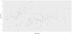
Note that the plot we just made looks quite good, despite the lack of any specific customization. This might be a surprising to those used to working with R’s base plotting functions. Indeed, this is one of ggplot2 most admired features. Minimal work is need to make your plots look good. As you might have observed, there is no need to specify titles for your axes, they are provided for you! Ggplot2 takes care of many things in the background. However, this does not mean nothing can be changed. By subsequently adding on different layers, we are able to customize almost every aspect of our plot. This includes adding color or legends, changing axis scales, even faceting our data to plot multiple graphs at once! All of this will be covered in the following tutorials.
If you would like to save this plot as a file so that you do not have to re-run your code to order to regenerate it, you may use the ggsave() function.
ggsave(“plot.png”, width = 5, height = 5)This will save your plot as a 5’ x 5’ file under the name “plot.png” in your current working directory.