Linear modeling is getting quite traction with the inclusion of complex machine learning algorithms. But there is no need to worry as this tutorial will provide you with a basic outlook about how you can predict in R programming. In this tutorial, we will kick off with the basic linear regression lm() function to create a linear model. After that, we will move onto the predictive analytics through R through build-in R datasets “cars” and “iris”. Already excited, let’s embark on your first ever machine learning voyage.
Installing the Libraries
Like always, we will start off by installing the necessary libraries:
#installing libraries
install.packages(“tidyverse”)
library(tidyverse)
Familiarizing with Cars Dataset
Once we are done with the libraries installation, we will proceed ahead with loading the relevant dataset, named “cars”. The dataset is about the cars stopping distances at different speeds.
# Loading the Dataset
data(cars)
Checking the data integrity is another important step that can be done through head(), str(), and glimpse() functions.
Linear Regression Model Creation
Linear model creation is quite easy and it could be done by:
# lm() Model Creation
fit.model <- lm(dist ~ speed,data = cars)
To view the model, you can use the summary() function:
# Taking a Peek at the Model
summary(fit.model)
Following output will be displayed:
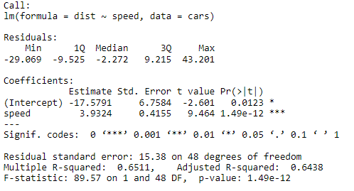
The data sounds a bit complex, isn’t it? Let’s explore it further what does it mean? We will explore it further in step-wise regression modeling tutorial in detail.
Predicting the Unpredictable
Without further ado, we are now going to look for the predict function. So, how do you call it?
# Calling Predict() through Dataframe
predict(<linear_model>,<dataframe>,<interval>)
Based on the syntax for the predict() function, we need three inputs:
- Linear Model – The linear model that you have created
- Dataframe – A dataframe that contains the values like to predict
- Interval – Can be either ‘Confidence’ or ‘Predictive’ intervals. This is not a necessary part for the function to perform but it is quite essential if you are using it for data analytics.
Let’s start the predictions by creating a dataframe of different values of speeds:
# Predicting the Values
# Creating New Data Frame
df.speed <- data.frame(
speed = c(23, 28, 33)
)
Once the dataframe is assigned with different speed values, let’s plug it into the predict() function.
# Have a Go at Predicting Values
predict(fit.model, newdata = df.speed)
Output:
![]()
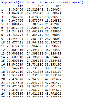
However, if you like to predict the values based on confidence or predictive intervals:
# Checking Confidence Interval
predict(fit.model, newdata = df.speed, interval = “confidence”)
Output:
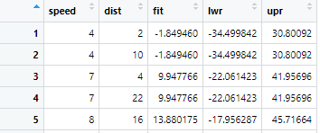
Let’s go on with prediction interval and use the cbind() to look for the dataset vs predicted values by assigning the dataframe:
# Modeling using Prediction Intervals
pred <- predict(fit.model, interval = “prediction”)
dat.pred <- cbind(cars, pred)
You can take a look at the dat.pred using view() function:
To make it more visually appealing, how about we plot it through ggplot. For that, first we have to invoke the ggplot2 library:
# Invoking ggplot Libraries
install.packages(“ggplot2”)
library(ggplot2)
Once the library is installed, we are good to plot:
# Plotting Prediction Interval and LM using ggplot
ggplot(dat.pred,aes(speed,dist))+
geom_point() +
geom_smooth(method = lm) +
geom_line(aes(y=lwr),color = “purple”, linetype = “dashed”) +
geom_line(aes(y=upr),color = “purple”, linetype = “dashed”)
Output:
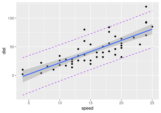
For starters, the plot shows the linear regression line in line with geom_smooth() with lm() method to incorporate the LOESS smooth line whereas the lwr and upr intervals are plotted through geom_line(). I know it looks a bit complex, we can further explore ggplot2() in another articles.
Another Dataset another Story
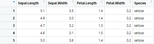
Let us go and explore another dataset called “iris” which categorizes three different types of flowers with sepal length, sepal width, petal length, and petal width as the variables.
##Another Example Dataset
data(iris)
You can start off by following same data integrity ritual and look for abnormality in dataset. Once that is done, we are going to create a linear model for the setosa species only. So, we will have to filter the dataset:
##LM Creation for setosa species
# Creating a Dataframe with Setosa species only
iris_setosa <- filter(iris, Species == “setosa”)
You should also recheck the dataframe using view() to check if everything went according to your needs:
# Taking a peek at iris_setosa dataset
view(iris_setosa)
Output:
Everything looks peachy! Now, we can go ahead with model creation of it:
#Model Creation
model_setosa <- lm(Sepal.Length ~ Sepal.Width,data = iris_setosa)
This time we will explore the data with confidence as well as prediction intervals. First, you will have to make a dataframe
# Modeling using Confidence Intervals
c_setosa <- predict(model_setosa, interval = “confidence”)
conf_setosa <- cbind(iris_setosa, c_setosa)
# Plotting Confidence Interval and LM using ggplot
ggplot(conf_setosa,aes(x=Sepal.Width,y=Sepal.Length))+
geom_point() +
geom_smooth(method = lm) +
geom_line(aes(y=lwr),color = “coral”, linetype = “dashed”) +
geom_line(aes(y=upr),color = “coral”, linetype = “dashed”)
Output:
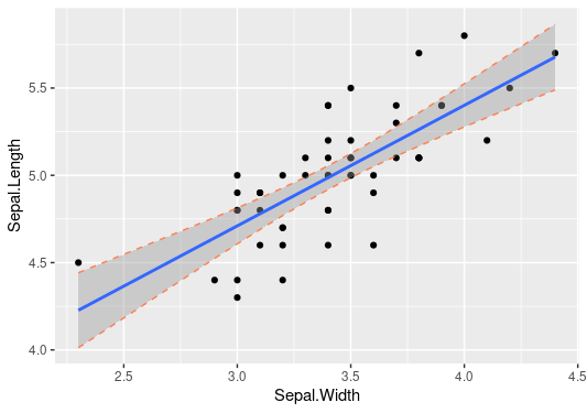
It looks a bit strange, doesn’t it? Don’t worry we can explore it further after the prediction interval modeling:
# Modeling using Prediction Intervals
pred_setosa <- predict(model_setosa, interval = “prediction”)
data_setosa <- cbind(iris_setosa, pred_setosa)
Now, let’s get ahead with plotting with prediction intervals:
# Plotting Prediction Interval and LM using ggplot
ggplot(data_setosa,aes(x=Sepal.Width,y=Sepal.Length))+
geom_point() +
geom_smooth(method = lm) +
geom_line(aes(y=lwr),color = “coral”, linetype = “dashed”) +
geom_line(aes(y=upr),color = “coral”, linetype = “dashed”)
Output:
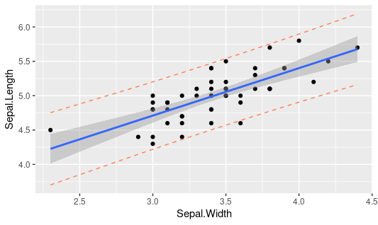
Hmm, that looks to have a wide band of upr and lwr values as compared to those of confidence intervals. Let me briefly describe the difference between the two plots that lies within the very definition of confidence and prediction intervals. For starters, the confidence intervals shows the sampling uncertainty and is based on the statistic estimated based on multiple values. In simpler terms, sampling uncertainty stems out of the fact that the data is a random sample of the whole population that we are going to model. On the other hand, prediction interval showcases the intrinsic uncertainty of each data point along with the sampling uncertainty. It’s the core difference; however, we can further explore the same in pure statistics tutorials.
All in a Nutshell!
All in all, predict function can provide valuable insight to the data that can allow us to predict the potential data points based on either the confidence or prediction intervals. We have explored two different datasets for the same and found some amazing analytics insight through ggplots. Linear regression backed with predict() function can be the first step in model training that can prove to be a cornerstone for your machine learning journey.
Going Deeper…
If you’d like to know more about the measures of central tendencies and dispersion, you can find it out here:
Linear Modeling:
- How to Create a Linear Model in R using lm Function
- Stepping into the World of Stepwise Linear Regression in R
- Mitigating Multicollinearity through Variable Inflation Factor
Plotting:
- Making an abline in R
- Guide to use ggplot2 scatter plots
- How to Create Linear Model in R using lm Function