Data science has many graphical ways of displaying data, and each provides unique types of information about the data being presented. If you want to see how a field of data is spread over a given area, a heat map is a useful tool. Heat maps illustrate the distribution of data in color changes over the surface that is being illustrated.
What is a heat map?
Heat maps are a graphical representation of data over a given area in terms of color. The term “heat map” gives one the impression of a visual representation of temperature over a given area and while they do have this application, they can be used to represent any field of data over an area. This is true whether that area is physical or informational. Ironically, the origin of the term “heat map” has nothing to do with temperature but it was invented to refer to graphical displays of real-time financial data.
Heat Maps can be used to display any two-dimensional data chart, though they are more useful for some datasets than others. They are useful for displaying fields of data in real-world areas. This is because they help illustrate how the values change over that area. A good example of this would be a heat map of the wifi in your home. Such a heat map would show you where the best places for your devices are.
The heatmap function.
The heatmap function has the form of heatmap(x, scale, na.rm, col, labRow, labCol, main) and it produces a heat map of the data.
- x is the numeric matrix containing the values being used in creating the heat map.
- col is the color palette to be used by the heat map.
- na.rm is a logical value that determines whether NA values should be removed.
- labRow is a vector of the row labels and is rownames(x) by default.
- labCol is a vector of the column labels and is colnames(x) by default.
- main is the name of the heat map.
- scale is used to determine where the values are to be centered and scaled in. It can have the values of “row”, “column”, or “none” and is “row” by default.
Applications of the heatmap function.
The applications of the heatmap function include any two-dimensional data chart. However, they are particularly useful for displaying lots of data points over a surface area to show how the data changes in different locations. For example, if you are interested in seeing temperature varies in your home, a heat map of many temperature measurements throughout your home will provide you with a graphical representation of these changes that you may not see looking at the numbers. Even with small amounts of data, the colored graphical representation of a heat map can show patterns that would not be clear when looking at numerical values.
A basic heatmap in r.
Here is a test example of a heat map using random data. Ironically, it is more complicated than those using real-world data from existing R data sets. However, most of this is due to the need to set up the data frame, and the row and column labels. Since this is what you will need to do when you are working with your own data as opposed to data sets provided by R packages, it is part of the basic process.
# how to make a heatmap in R
ds = data.frame(rnorm(5, 50, 20),rnorm(5, 50, 20),rnorm(5, 50, 20),rnorm(5, 50, 20))
rn = c("Arm","Leg","Chest","Gut","Head")
cn = c("Ann","Bob","Tom","Joy")
x = data.matrix(ds, rownames.force = FALSE)
heatmap(x, labRow=rn, labCol=cn, main = "Test Heat Map")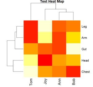
When you run this code, the resulting heat map has large blocks that allow you to clearly see the pattern in the data. Note that the row names Arm, Leg, Chest, Gut, and Head were added in the heatmap function. The same was done with the column names of Ann, Bob, Tom, and Joy. This step is not needed if a data frame contains the column and row names.
A real data set heatmap in r.
Here is a heat map of the distances between several US cities. This example illustrates how to use the heat map function with data sets from R packages while providing a look at a larger data set.
# how to make a heatmap in R
x = data.matrix(UScitiesD, rownames.force = TRUE)
heatmap(x, main = "Distances between US cities")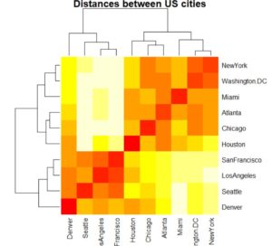
Here, the only two parameters that are being used are x and main. Because the data is already assembled, you only need to convert it to a numeric matrix that works with the heatmap function. One feature of this data that can be clearly seen is a straight line where the values are zero at each point where the cities are the same. The other noticeable features are the two dark areas on both sides of the central line.
A real data set heatmap in r with enhanced color.
In this example, we take the previous one and add a brighter color pallet to it. Everything else is the same except for the color palette, however, this produces a significantly bigger contrast in the values presented in this heat map.
# how to make a heatmap in R
x = data.matrix(UScitiesD, rownames.force = TRUE)
heatmap(x, col=rainbow(length(UScitiesD)), main = "Distances between US cities")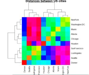
The results show the same symmetry as seen earlier but with brighter colors. The central line of zero values still shows up clearly, but the darker areas on both sides the central line are enhanced making them more interesting.
In most other programming languages, heat maps would be difficult to do, requiring lots of graphical calculations. R has a single function that handles the production of heat maps. This is where R shines, having one function for otherwise challenging tasks.