The interaction plots are another useful tool to visualize the relationship between a categorical (factor) variable with a continuous variable. It helps you conduct a two-way ANOVA (Analysis Of VAriance) study based on the common principle of hypothesis testing which will be covered in another tutorial. As a rule of thumb, if the interaction plot results in parallel lines, it implies that there is no interaction between the variables. However, if they intersect or converge, there is a strong chance that there is an interaction. In this article, we are going to use two datasets called “ToothGrowth” and “birthwt” for finding the interaction between different variables.
Installing the Libraries
We will kick off by installing the libraries:
# Install Packages
install.packages(“tidyverse”)
install.packages(“caret”)
install.packages(“leaps”)
library(tidyverse)
library(caret)
library(leaps)
Invoking the ToothGrowth Dataset
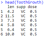
The “ToothGrowth” dataset provides a data about the changes in odontoblasts lengths (cells responsible for tooth growth in guinea pigs) based on different doses of Vitamin C (VC) or Orange Juice (OJ). Here, we are going to check for the interaction of the supplements and doses on the length of cells. Here is a brief overview of how the code and data looks like:
#Invoking ToothGrowth Dataset and Checking out the Data
data(ToothGrowth)
head(ToothGrowth)
Output:
Interaction Plots for ToothGrowth Dataset
Before heading towards the plotting part of the tutorial, let’s look at the syntax of the interaction.plot() function for better data presentation:
# Checking out Interaction Plot Syntax
interaction.plot(x.factor, trace.factor, response, fun,
xlab,ylab,
trace.label,
col,
lty,lwd)
Here:
x.factor = the factor that is assigned to x-axis
trace.factor = another factor that makes up the traces
response = response variable
fun = descriptive statistics like mean or median for hypothesis testing
xlab, ylab = labels of x-and y-axes
trace.label = Label of the Legends
col = color for the plotted values
lty = type of lines
lwd = width of lines
The syntax does look complex but there is nothing to worry about when you see it action.
Let’s proceed ahead with the interaction plot:
#Interaction Plot
interaction.plot(x.factor = ToothGrowth$dose,
trace.factor = ToothGrowth$supp,
response = ToothGrowth$len,
fun = mean, xlab=”Dose”, ylab=”Tooth Length”,
trace.label=”Supplements”,
col=c(“pink”,”skyblue”),
lty=2, lwd=3)
Output:
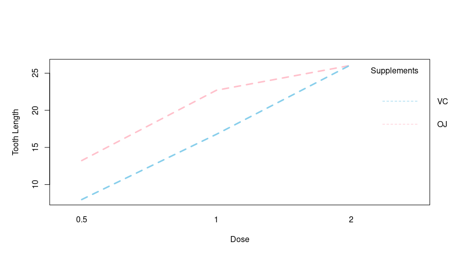
Based on the output, there is a clear interaction between the tooth length and dosage of both VC and OJ supplements. Let’s try this tool on another dataset.
Interaction Plots Using “birthwt” Dataset
For using the birthwt dataset, we are going to invoke MASS library
#Another Dataset from MASS Library
library(MASS)
Now, let’s load the dataset”
#Loading Dataset
data(“birthwt”)
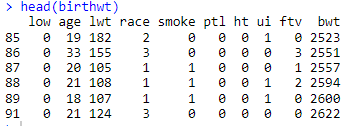
The “birthwt” dataset provide data about different risk factors that are associated with low birth weight in infants. It does have a number of variables as can be evident by head() function:
Here, I am going to explore the following three two-way interactions:
- Effect of race and smoking habits on infant birth weight
- Effect of hypertension history and smoking habits on infant birth weight
- Effect of uterine irritability and smoking habits on infant birth weight
Testing Interaction 1
Here for the sake of simplifying the code, I have used with() that makes the code easier to interpret and read.
# Interaction b/w race & Smoking Habit on Birth Weight
with (birthwt, {
interaction.plot(x.factor = race,
trace.factor = smoke,
response = bwt,
fun = mean, xlab=”Race”,ylab=”Birth Weight”,
trace.label=”Smoking”,
col=c(“pink”,”skyblue”),
lty=2, lwd=4)
})
Output:
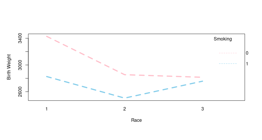
Let’s interpret the output, the mother’s race (1=white, 2=black, 3=other) shows some interaction as the plot converges. Let’s proceed head with interaction 2
Testing Interaction 2
For checking the interaction hypertension history and smoking habits on infant birth weight, we use the following code:
with (birthwt, {
interaction.plot(x.factor = ht,
trace.factor = smoke,
response = bwt,
fun = mean, xlab=”Hypertension”,ylab=”Birth Weight”,
trace.label=”Smoking”,
col=c(“pink”,”skyblue”),
lty=2, lwd=4)
})
Output:
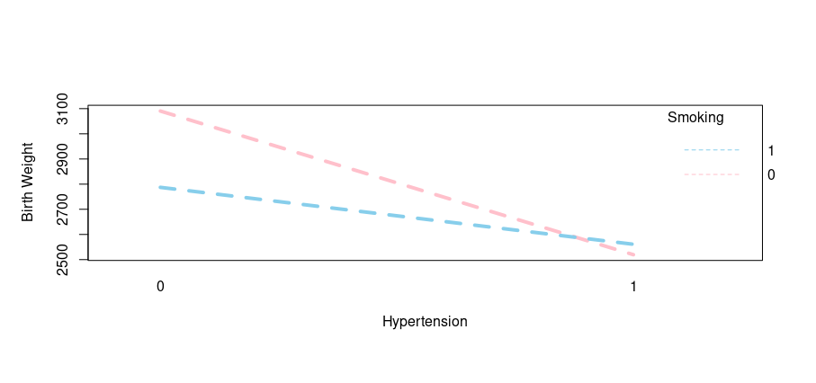
As evident from the output, here is another example of interaction as the hypertension history along with smoking habits can impact infant birth weight. Let’s move ahead with our final interaction.
Testing Interaction 3
Here we are going to check the interaction of uterine irritability and smoking habits on infant birth weight:
# Interaction of Uterine Irritability & Smoking Habit on Birth Weight
with (birthwt, {
interaction.plot(x.factor = ui,
trace.factor = smoke,
response = bwt,
fun = mean, xlab=”Uterine Irritability”,ylab=”Birth Weight”,
trace.label=”Smoking”,
col=c(“pink”,”skyblue”),
lty=2, lwd=4)
})
Output:
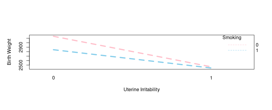
Wow, another interaction witnessed! You can literally choose other risks factors and practice on your own as well.
Concluding Remarks
Interaction plots allows us to find the interaction of different variables in a dataset on a response variable (response variable = cell length or infant birth weight). The plots also provide a visual representation of the complex ANOVA calculations that uses statistics like F values or Pr(>F) that is somewhat difficult for data novices to understand and interpret.
Going Deeper!
If you’d like to know more, you can find it out here:
Linear Modeling:
- How to Create Linear Model in R using lm Function
- Exploring the Predict Function in R
- Stepping into the World of Stepwise Linear Regression
Plotting in R:
- Introduction to ggplot2()
- How to Plot Categorical Data in R (Basic)
- How to Plot Categorical Data in R (Advanced)
Basics of Descriptive Statistics