One of R’s key strength is what is offers as a free platform for exploratory data analysis; indeed, this is one of the things which attracted me to the language as a freelance consultant. Given the attraction of using charts and graphics to explain your findings to others, we’re going to provide a basic demonstration of how to plot categorical data in R.
Introducing the Scenario
Imagine we are looking at some customer complaint data. This consists of a log of phone calls (we can refer to them by number) and a reason code that summarizes why they called us. Assume we have several reason codes:
- A – Bad Product
- B – Shipping
- C – Packaging
- D – Other
Now that we’ve defined our defect codes, we can set up a data frame with the last couple of months of complaints.
# How To Plot Categorical Data in R - sample data

> complaints <- data.frame ('call'=1:24, 'product'=rep(c('Towel','Tissue','Tissue','Tissue','Napkin','Napkin'), times=4), 'issue'=rep(c('A - Product','B - Shipping','C - Packaging','D - Other'), times=6))

> head(complaints)
  call product         issue
1    1   Towel   A - Product
2    2  Tissue  B - Shipping
3    3  Tissue C - Packaging
4    4  Tissue     D - Other
5    5  Napkin   A - Product
6    6  Napkin  B - Shipping
> summary(complaints)
      call         product             issue
 Min.   : 1.00   Napkin: 8   A - Product  :6
 1st Qu.: 6.75   Tissue:12   B - Shipping :6
 Median :12.50   Towel : 4   C - Packaging:6
 Mean   :12.50               D - Other    :6
 3rd Qu.:18.25
 Max.   :24.00
So, now that we’ve got a lovely set of complaints, lets do some analysis.
How To Plot Categorical Data in R
A good starting point for plotting categorical data is to summarize the values of a particular variable into groups and plot their frequency. We’re going to do that here. The one liner below does a couple of things.
- use table () to summarize the frequency of complaints by product
- Sort the table in decreasing order
- Use barplot to generate a basic plot of the distribution
# How To Plot Categorical Data in R - sample data
> barplot(sort(table(complaints$product),decreasing=T))
Yielding the following chart
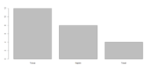
Which Products Are Generating Complaints?
If we produced the products in similar quantities, we might want to check into what is going on with our paper tissue manufacturing lines.
How To Plot Categorical Data in R – Proportions
Another common ask is to look at the overlap between two factors. You can accomplish this through plotting each factor level separately. We’re going to use the plot function below.
# How To Plot Categorical Data in R - heatmap comparison
> plot(issue ~ product, data=complaints)
Which produces:
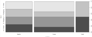
Admittedly Contrived, But You Can See Patterns In Issues By Product….
Other Common Tables and Charts for Categorical Data
These two charts represent two of the more popular graphs for categorical data. The
bar graph of categorical data is a staple of visualizations for categorical data. The spineplot heat-map allows you to look at interactions between different factors. These are not the only things you can plot using R.
You can easily generate a pie chart for categorical data in r. Look at the pie function.
Along the same lines, if your dependent variable is continuous, you can also look at using boxplot categorical data views (example of how to do side by side boxplots here).
That concludes our introduction to how To Plot Categorical Data in R. As you can see, there are number of tools here which can help you explore your data…
Going Deeper…
Interested in Learning More About Categorical Data Analysis in R? Check Out
Graphics
Tutorials