Statisticians and researchers often need a histogram to study a dataset that holds continuous values. It shows you the distribution of the frequency of the data and helps you understand elements such as the skew and outliers present in a dataset.
You can easily create a histogram in R using the hist() function in base R. This has a many options that give you control of bin sizes, range, etc. You can also use ggplot.
In this tutorial, I will explain what histograms are and what you can do with them along with some basic methods for plotting histograms in R.
What is a Histogram?
A histogram shows the distribution of data in terms of frequency count. Although some may find a close similarity between bar charts and histograms, there is one subtle but very important difference. While a bar chart shows the frequency of discrete variables, a histogram shows data for continuous data. Therefore, you may find gaps between the bars of a bar chart, but a histogram represents a continuous distribution with no gaps.
In order to effectively explain the usage of a histogram, I will start with an example. Down below you can see a histogram for a built-in dataset of R, “AirPassengers”. It shows data for how many passengers travelled by air each month for 10 years.
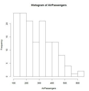
Histogram of Frequency in R
The x-axis shows you the number of passengers travelling by air and the y-axis shows you how often a figure in a given range on the x-axis appeared in the data. The x-axis has been divided into intervals of x values; these intervals are called bins.
In the plot you can see that 100 to 200 passengers travelled by air more than 20 times whereas 500 to 550 passengers travelled a little less than 5 times. Something you should have noticed here is that the chart doesn’t show data for precisely 100 passengers or 550 passengers. Instead, it gives you a range of continuous values in which the x-axis has been categorized into. This is precisely why a histogram does not have gaps like a bar chart.
Moreover, you can also identify the outliers on the extreme right, showing that instances where there were more than 200 passengers travelling by air occurred around 2 to 3 times in 10 years.
Why Do You Need a Histogram?
Now you may still be wondering why exactly we needed the histogram when there are other ways to obtain similar information. I have listed some of the most frequent uses of histograms down below.
Find Commonly Occurring Events
A researcher may have spent a while collecting data and now, he or she may be wondering what is the most frequently occurring event in the data. A histogram shows the relative frequency in continuous terms, hence helping us understand the range where the densest observations lie.
Understand the Pattern of Your Data
Your data may sometimes show a normal distribution and sometimes it may not. Moreover, if the data is symmetric, i.e., it is normal, you may be interested in learning how symmetric it is using a visual tool.
A histogram neatly displays the distribution of the data hence helping you identify whether your data follows a pattern and, if so, the kind of pattern that it follows.
Identify Deviations
Someone working with data won’t always see everything aligned perfectly. When studying trends in a data, a histogram can easily tell you if your data deviates from expected values in any range.
Suppose you had expected a specific result from an experiment but when conducted, it gave you a different distribution. This immediately tells you something is wrong, and you need to go back and re-check things.
Plotting a Histogram in R
Now that you have some working knowledge of a histogram and what you can do with it, I can proceed to show how you can obtain one in R. I’ll continue working on “AirPassengers”, a built-in dataset of R. First, we’ll load the data.
# r histogram example - load dataset
> data(AirPassengers)
You can now plot a histogram using the “hist()” function. The function uses a vector of values as an input and returns a histogram for those values.
# r histogram example - hist function in r
> hist(AirPassengers)
[You can get some more detail with the “hist()” function by adding additional parameters to specify x and y labels and changing the bin width. In the code below, I have changed the bin width by specifying that my histogram uses 5 intervals. Moreover, I have also limited the x values (number of passengers) between 100 and 500.
# Frequency histogram in r (Formatting Options)
> hist(AirPassengers, main="My hist() Plot ", xlab="# of Passengers", xlim=c(100,500), breaks=5)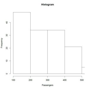
Something you may have noticed here is that although I specified bin count to be 5, the plot uses 4 bins. The parameter “breaks” in the”hist()” function merely takes a suggestion from the user and produces intervals either close to or equal to the user defined value. In R, the “hist()” function uses a predefined algorithm to calculate bins and it still uses the same algorithm only staying close to the user specification.
Another very interesting tweak you can make is by choosing unequal bin width for different intervals. In the code below, I have divided the bins into a width that depends on the quantile of each range. You can try out other methods by specifying a vector that holds values for the width for each interval.
# how to generate a histogram in r - unequal bins
> hist(AirPassengers, breaks = quantile(AirPassengers, 0:10 / 10))
Other Methods for Plotting Histograms in R
R gives a number of methods to perform any basic function and each has its pros and cons. An additional method that I find very interesting is through the use of the “qplot()” function in the “ggplot2” package. You can start by installing the package if you haven’t done that already.
# histogram in R ggplot2 example
> install.packages(“ggplot2”)
> qplot(AirPassengers, geom="histogram")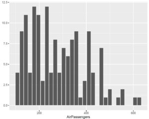
Conclusion
Histograms are very commonly used for analysis in data science because of the amount of information they pack between the bars. This tutorial aimed at giving you some insight on how histograms are created using R. However, if you are interested in going a few steps ahead, I encourage you to read the R documentation on the “hist()” function and try out a couple of more tweaks. This should help you get some more clarity on how the function really works and what you can use it for.
Going Deeper…
Interested in Learning More About Categorical Data Analysis in R? Check Out
Graphics
Tutorials
- How To Create a Contingency Table in R
- How To Generate Descriptive Statistics in R
- How To Create a Histogram in R
- How To Run A Chi Square Test in R (earlier article)
The Author:
Syed Abdul Hadi is an aspiring undergrad with a keen interest in data analytics using mathematical models and data processing software. His expertise lies in predictive analysis and interactive visualization techniques. Reading, travelling and horse back riding are among his downtime activities. Visit him on LinkedIn for updates on his work.