It is often much easier to see patterns in data when that data point or dataset is presented as a graph such as a vertical or horizontal boxplot rather than seeing a string of numbers. There are numerous types of graphs, each of which can show different types of relationships and patterns. The base R boxplot is a graph that shows more than just where each value or numeric variable is in the sample size.
Side-By-Side Boxplots
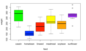
A side by side boxplot R provides the viewer with an easy to see a comparison between data set features. These features include the maximum, minimum, range, center, quartiles, interquartile range, variance, and skewness . It can show the relationships among each data point of a single data set or between two or more related dataset examples. The form of this type of graph is a box showing the quartiles, which lines showing the rest of the range of the data set. When used to compare related data sets the visual comparison can speak volumes, allowing you to see things like boxplot outliers, the lower whisker, sample size, log scale, and other graphical parameters.
How to Make a Side-By-Side Boxplot in R
Doing a side by side vertical or horizontal boxplot R involves using the boxplot() function which has the form of boxplot(data sets) and produces a side by side boxplot graph of the data sets it is being applied to. You can enter one or more data sets. This function also has several optional parameters, including r boxplot options like:
- main – the main title of the breath.
- names – labels for each of the data sets.
- xlab – label before the x-axis,
- ylab – label for the y-axis
- col – color of the boxes.
- border – color of the border.
- horizontal – determines the orientation to graph.
- notch – appearance of the boxes.
# boxplot r
> x = 1:10
> boxplot(x)
Here is a simple illustration of the boxplot() function. Here the values of x are evenly distributed. If you run this code, you will see a balanced boxplot graph.
# how to make boxplot in r studio
> y = c(1,4,5,6,9)
> boxplot(y)
Here is a simple illustration of the boxplot() function with the values of x concentrated towards the center. If you run this code, you will see a boxplot graph with the box a little squished when compared to the one above.
Applications
The applications of creating a boxplot using R are numerous. Here is an illustration the code for comparing the gas mileage of 4 Cylinder cars to 8 cylinder cars.
# how to make a side by side boxplot in r
> cyl4 = mtcars$mpg[which(mtcars$cyl==4)]
 > cyl8 = mtcars$mpg[which(mtcars$cyl==8)]
 > par(mfrow=c(1,2))
 > boxplot(cyl4)
 > boxplot(cyl8)
 > par(mfrow=c(1,1))
 > boxplot(cyl4,cyl8,
 +         main = "4 cylinders versus 8 cylinders",
 +         ylab = "Miles per gallon",
 +         names = c("4 cylinders", "8 cylinders"))
The top two boxplot() functions what the two graphs side by side. The bottom boxplot() function put both boxplots in the same graph. It also illustrates some of the optional parameters of this function that you can use when learning how to create a boxplot in R.
The boxplot() function is an extremely useful graphing tool that many programming languages lack. It serves as an example of why R is a useful tool in data science.
How to Create a Grouped Boxplot
For a grouped boxplot, look at our guide to using the ggplot2 package to create a ggplot2 boxplot. Tidyverse has powerful graphing features, in the event you want to weave in bar graphs or barplot charts using the same data frame.
How to Create a Notched Box Plot
For a notched box plot, set the “notch” parameter to notch=”true” in the boxplot command. That will create a notched box plot from your dataframe. This adjusts the display for the upper quartile and lower quartile to show the slope of the interquartile range. This helps visualize data values.
Broader Perspective on Box Plot Graphs
The box plot and the whisker plot is a powerful tool for quickly assessing the impact of a categorical variable on a numeric variable. By making a graph of multiple boxplots like the one above, you can quickly scan for cause and effect relationships. The numerical variable should represent the y variable for the statistical model you’re trying to build. You can quickly review the median, 1st quartile, 3rd quartile, interquartile range, and suspected outliers. The boxplot function simplifies generating these charts in a script.
If you are presenting to a large audience and want to discuss the variation in a numerical variable, a single boxplot or histogram are good visual aids. There are many things you can do with R to polish the format for a presentation (axis label, figure tweaks, point and tick mark format, graphical parameters). These are a useful way to visualize the distribution of a variable, better than a scatterplot.
The other thing i like about a boxplot is they don’t require assumptions about a normal distribution. You’ll need to make assumptions if you want to share a confidence interval, but they are great if you want to share the basics about a data set. Very helpful for your initial view of numeric data (eg. numeric vector or quantitative variable)
We hope this tutorial on how to make a side by side boxplot in R was helpful, and encourage you to check out the rest of our site for all of your R programming needs!