
So you have your data, now what? With a little R code, you can quickly get to know a lot about your dataset. By taking care of basic data hygiene, gathering summary statistics, and taking a quick look at your data through graphs first, your later analysis is strengthened and simplified. The graphs you produce in this tutorial will not only be useful for your understanding, but also for communicating your results in a report or article.
In this tutorial, we’ll cover how to to all of that in R, using the program RStudio. To keep this from getting to complicated, we’ll also stick to only using functions that exist in the base R program.
We’ve used a file already in the R library for this tutorial: co2. It’s a popular and well-supported dataset showing the concentrations of carbon dioxide in the atmosphere over the several decades. If you’re already comfortable using R, you can use your own data by modifying the sample code. In the next section, we’ll show you how to add the co2 file to your code, so you can take it out on your first date.
Making Introductions
One of the reasons that R is so attractive to scientists and data analysts is the breadth of its scope. With the right extensions, its full functionality can be used on most any file type or database format. For the purposes of this tutorial, to keep it clear and simple, we’ll walk through getting to know a file already in the R library.
Uploading Data
To add the ‘co2’ dataset to your environment in RStudio, run ‘data(co2)’. Data() tells R where to find the dataset, and ‘co2’ calls the dataset.
Checking for Accuracy
It’s important to check that R uploaded your entire dataset with the correct headers and labels. Common practice is to print a snippet of the dataset in R and cross-reference that with what your dataset in the program you created or found it in. The head and tail functions allows you to do this by printing a sample of the entries. Use ‘head(co2)’ to take a look at your first few entries.
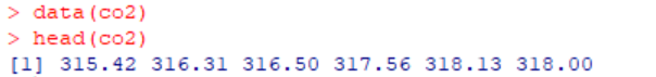
Use ‘tail(co2)’ to have R print the last. If these look right, you can be fairly sure that your dataset loaded correctly

Getting to Know Your Data
Now that your dataset is loaded into R, you’re ready to get to know it. R has several quick functions you can run to visualize and understand your data enough to select the proper statistical tools later in your analysis.
Seeing your First Patterns
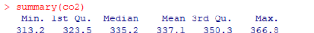
R offers a quick and simple tool, the summary function, for numerically checking the patterns in your data. Taking a look at your quantiles, median, and mode is as easy as running the code ‘summary(co2)’. What you’ll see next are the summary statistics for co2 concentrations in an easy-to-read table.
Visualizing your data
While that table is useful, it doesn’t tell you what your data actually looks like. Next, we’ll produce a quick plot in order to visually get a sense of how the data is distributed and if there are any quirks, like outliers.
Plot is a handy function built into base R just for this purpose. Since co2 concentrations are continuous, you can use the code ‘plot(co2)’ as is, without manipulation, to take your first look at the data.
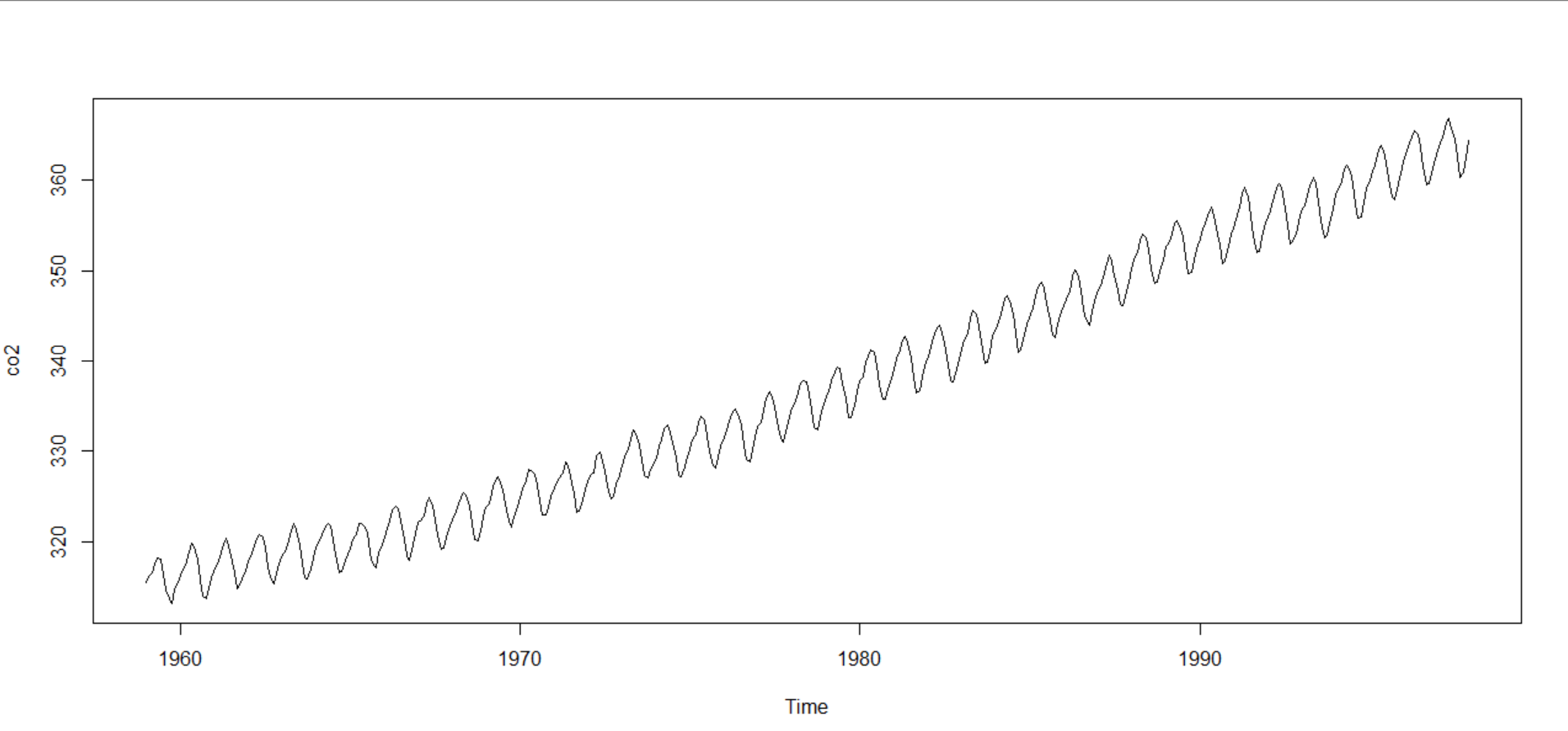
You can see that the data generally trends upwards and oscillates over the course of each year. There are no obvious outliers to worry about, and it seems that the relationship is linear. These observations allow you to start making general conclusions about your data and see where to go next.
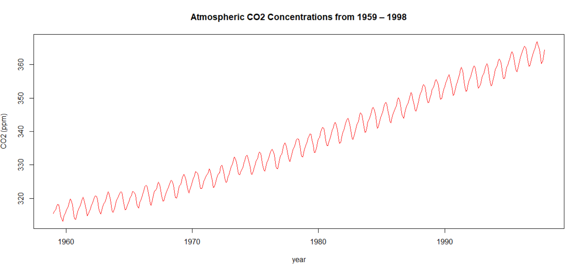
This plot was helpful for you to understand your data, but to use it for anything else requires a few updates. You can alter parameters within the plot function to produce a professional quality graphic. Run the code ‘plot(co2, xlab = ‘year’, ylab = ‘CO2 (ppm)’, main = ‘Atmospheric CO2 Concentrations from 1959 – 1998’, col = ‘red’)’ to put the finishing touches on your graph.
Planning your Next Date
Things have gone smoothly so far. You now know enough about your data to choose further testing and even have some figures that show relevant trends in your data. With your data already loaded into R, you can explore the rest of the functionality that R has to offer.
If you’re new to R, you’re likely surprised at how efficient it is. Unlike in other statistical software, many of the functions you use constantly are already loaded in. Calling functions and printing their results can be done in one step. Plus, by using RStudio, all of your figures are quickly accessible and stored for future use.
Also- if you’re in a hurry and need a simple tool, check out our new statistics calculator (free, web based).