Overlaying histograms are needed whenever we have two or more different data sets that need to be compared, for this reason, these are also called comparative histograms. Overlaying histograms give you a visual comparison of statistical parameters of the data such as mean, standard deviation, skew and relative kurtosis. Throughout this tutorial, I will be using the terms overlaying histograms and overlapping histograms interchangeably, they refer to the same plot, nonetheless.
The term relative here is important when talking about overlapping histogram because we are specifically interested in how one data set differs from another data set, absolute parameters can be better studied on single histograms. I will be focusing on plotting the data using a relative scale throughout this tutorial, and we will be exploring multiple ways of doing this. As I stress upon many times in my tutorials, R gives you many ways to go about a certain task and our job as programmers is to find the most efficient method.
Coding isn’t always about reducing the number of lines in your code, it should be something that another programmer can look at and understand easily as well. I will therefore be working my way from a more detailed and explanatory method to a more concise and short method.
Creating Overlaying Histograms in R
We’ll first begin by creating two data sets, these two would be the sets for which we want to overlap the histograms. It is therefore important that one of my data set has a noticeable variation from the other, this would let us compare our data sets visually as well (once we have the plots).
> Data_1 <- rnorm (2000,22,4)
> Data_2 <- rnorm (1800,16, 3)
The next thing I’ll be doing is that I will calculate the histograms but not plot them, i.e., I will be storing the histograms for both data sets in two different variables and I will then proceed to simultaneously plot those histograms.
> Histogram_1 <- hist( Data_1, plot = FALSE)
> Histogram_2 <- hist( Data_2, plot = FALSE)
The variables ‘Histogram_1’ and ‘Histogram_2’ store the calculated histograms for both the data sets here. Next I will be plotting the histogram for the first data set, the histogram for the second data set will be placed on top of this one with a different color.
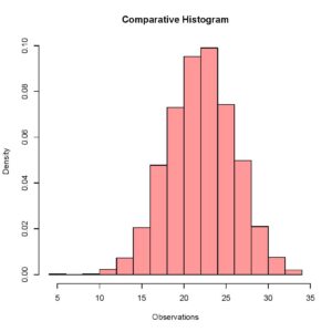
> plot (Histogram_1, col = rgb(1,0,0,0.4),xlab = 'Observations',freq = FALSE, main = 'Comparative Histogram')The rgb() command here specifies the color for the histogram of this data set and setting frequency equal to false allows me to visualize relative frequencies when both the data sets have been plotted. Your plot should look like this.
[With our first plot created, I will be creating a second plot with a different color that will be placed on top of the previous plot on the same quartz window.
> plot (Histogram_2, xaxt = 'n', yaxt = 'n',col = rgb(0,0,1,0.4), add = TRUE, freq = FALSE)Something you have to be very careful about here is that you do not have to close the previous quartz window when plotting the second histogram, that would result in an error because setting the add parameter equal to true explicitly tells R to add this histogram to the previously running quartz window. If R does not find a previously running quartz window, it gives an error. Your updated plot should look like this.
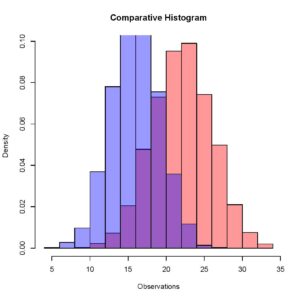
[Here you can see that the two different histograms have slightly different means, and this is comparable quite easily when we have both the histograms overlapping in one window.
Overlaying Histograms Using ggplot
The method I am now going to use requires the ggplot package. In this method we’ll be combining our data sets and hence making it one data set using the rbind function of R. This will be followed by the plotting command of the ggplot package that generates the histograms. If you haven’t installed the package yet, you can do that using the install.packages command.
> install.packages('ggplot2')To make the entire discussion clearer, we will work our way through the code. I’ll start from the beginning, by defining our data set. It is required that we use a data frame as the input data type for the histograms because we wish to combine our data sets and that is easier with data frames compared to vectors. Our initialization should look like this.
> Data_1 <- data.frame( Observation = rnorm(2000, 22, 4) )
> Data_2 <- data.frame( Observation = rnorm(1800, 16, 3) )
Next we’ll be combining our data into one variable with the rbind function.
> CombinedData <- rbind (Data_1, Data_2)We can now use this variable, ‘CombinedData’, to generate our overlapping histograms. You may have noticed that I have named my vector of numeric values, ‘Observation’ in the data frame. This serves as my x axis when making the overlapping histograms. The ggplot command to generate overlapping histograms for this data set should look like this.
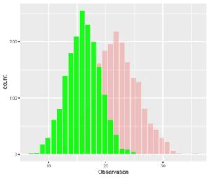
> ggplot(CombinedData, aes(x= Observation)) + geom_histogram(data = Data_1, fill = "red", alpha = 0.2) + geom_histogram(data = Data_2, fill = "green", alpha = 0.9)The aes() parameter specifies the x and the y axes and the geom_histogram() is specified for each additional data set for which we need an overlapped histogram. Each geom_histogram() parameter added requires that a fill and an alpha is specified. The fill is the color of the histogram and the alpha is a measure of the transparency for the histogram. Your plot of overlapped histograms should look like this.
[The ggplot package gives you some very interesting ways of plotting data. You can even create a function that allows you to overlap histograms with density plots. I encourage you to practice the plotting functions in this package and find ways to get overlapping histograms with more efficient methods in R.