Introduction
In statistics, correlation pertains to describing the relationship between two independent but related variables (bivariate data). It can be used to measure the relationship of two variables measured from a single sample or individual (time series data), or of two variables gathered from multiple units of observation at one point in time (cross-sectional data), or two variables from multiple samples / individuals over a period of time (panel data) (Homes, Illowsky, and Dean 2017).
Correlation statistics has been around for more than a century, starting with the work of Auguste Bravais (1846) and Karl Pearson (1896) (Okwonu, Asaju, and Arunaye 2020). It is very straightforward to implement and is an essential tool in the data analysis / data science toolbox. It is usually implemented prior to the conduct of predictive statistics like linear regression. It seeks to determine the (highly correlated) variables in the data set that can function as good predictors of a desired outcome.
Libraries, functions and data
In this tutorial, we will be learning how to apply the cor() function to a dataset and how to interpret the results. The cor() function is part of the base R stats library. It comes default in R. However, for data wrangling and visualizaton, we will be using functions from the dplyr, ggplot2, and tidyr packages.
library(dplyr)
library(ggplot2)
library(tidyr)
We will be using the data set trees contained in R. This data set provides measurements of the diameter, height and volume of timber in 31 felled black cherry trees. Note that the diameter (in inches) is erroneously labelled Girth in the data. It is measured at 4 ft 6 in above the ground (Ryan et al. 1976; R Core Team 2021).
Here are the first 10 observations in the trees dataset.
data(“trees”)
head(trees, n = 10)
## Girth Height Volume
## 1 8.3 70 10.3
## 2 8.6 65 10.3
## 3 8.8 63 10.2
## 4 10.5 72 16.4
## 5 10.7 81 18.8
## 6 10.8 83 19.7
## 7 11.0 66 15.6
## 8 11.0 75 18.2
## 9 11.1 80 22.6
## 10 11.2 75 19.9
Let’s say we want to test they hypothesis that the diameter of the tree determines the volume of timber better than its height. Correlation will be a good tool for this analysis.
Correlation by visualization
Scatter plots are good tools for determining correlations between a pair of variables. In any protocol involving correlation analysis, it would be wise to first visualize the data. Here, we plot volume vs. height and volume vs. diameter(girth).
par(mar = c(4, 4, .1, .1))
trees %>%
ggplot(aes(Volume, Height)) +
geom_point(stat = “identity”) +
geom_smooth(method = “lm”)
trees %>%
ggplot(aes(Volume, Girth)) +
geom_point(stat = “identity”) +
geom_smooth(method = “lm”)
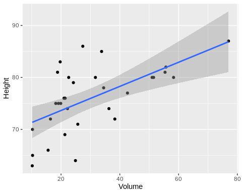
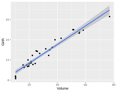
From the plots, we can immediately see that volume is more correlated with diameter than height.
Correlation workflow
Correlation statistics in R is executed by the function corr(). The two variables must be specified along with a method. There are 3 options: pearson (the default), spearman, and kendall. It is important to determine which of these 3 correlation methods is appropriate for your data. Pearson correlation assumes normal distribution of the data alongside other assumptions like homoscedasticity. Spearman and Kendall are non-parametric methods with the former best suited for ordinal data.
Check for normality
Because one has to choose between a pearson correlation (parametric) or an spearman or kendall correlation (non-parametric), a preliminary test for normality is apparent. To test whether our variables follow normal distribution, we can perform the Shapiro-Wilk test for normality for each of them.
shapiro.test(trees$Girth)
##
## Shapiro-Wilk normality test
##
## data: trees$Girth
## W = 0.94117, p-value = 0.08893
shapiro.test(trees$Height)
##
## Shapiro-Wilk normality test
##
## data: trees$Height
## W = 0.96545, p-value = 0.4034
shapiro.test(trees$Volume)
##
## Shapiro-Wilk normality test
##
## data: trees$Volume
## W = 0.88757, p-value = 0.003579
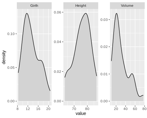
A p-value > 0.05 suggests that the distribution of the data does not vary significantly from a normal distribution. Based on these tests, Girth and Height approximate normal distribution while Volume does not. It should also help to generate a density plot from the data points of the variables. This is helpful in determining what type of data transformation can be applied to transform the data into normally distributed values, should you choose to do so.
trees %>%
pivot_longer(everything(), names_to = “var”, values_to = “value”) %>%
ggplot(aes(value)) +
geom_density(fill = “lightgray”) +
facet_wrap(~var, scales = “free”)
Executing the correlation analysis
Since one of the variables in the data set is not normally distributed, the kendall method is the more appropriate method to measure correlation.
cor(trees$Volume, trees$Girth, method = “kendall”)
## [1] 0.8302746
cor(trees$Volume, trees$Height, method = “kendall”)
## [1] 0.4496306
Interpreting correlation coefficents
Correlation coefficients range from -1 to +1. A correlation coefficient can tell us the direction of the relationship (positive or negative) and the strength of the correlation (magnitude).
| Correlation coefficient | assessment |
| 1 | perfect positive correlation |
| 0.8 | fairly strong positive correlation |
| 0.6 | moderate positive correlation |
| 0 | no correlation |
| -0.6 | moderate negative correlation |
| -0.8 | fairly strong negative correlation |
| 1 | perfect negative correlation |
The Kendall rank coefficient (τ) for the Volume vs. Girth is higher than that of Volume vs. Height. Confirming our hypothesis that tree diameter is a better indicator of the volume of timber produced by a felled tree.
Generating a correlation matrix
A nifty trick in the cor() function is to call the data set itself without specifying which variables to correlate. This produces a pairwise correlation matrix comparing all combinations of variable in the data set.
cor(trees, method = “kendall”) # wrapping this in a round() function adjusts how many decimal places you want in your coefficients; e.g. round(cor(trees, method = “kendall”),2)
## Girth Height Volume
## Girth 1.0000000 0.3168641 0.8302746
## Height 0.3168641 1.0000000 0.4496306
## Volume 0.8302746 0.4496306 1.0000000
This is particularly helpful if you have a data set with a lot of variables. Moreover, you can also create a visualization of the correlation matrix using the corrplot package or the ggcorplot package.
Missing values
Let us look another dataset: airquality. The Solar.R (Solar radiation in Langleys in the frequency band 4000–7700 Angstroms from 0800 to 1200 hours at Central Park) and Temp (Maximum daily temperature in degrees Fahrenheit at La Guardia Airport. variable from the airquality data set follow normal distribution. Thus, we can use the pearson method to determine whether there is a correlation between these variables. However, Solar.R has 7 NA’s. For correlation analysis, it is required that all data must be paired.
airquality %>%
select(Solar.R, Wind) %>%
summary()
## Solar.R Wind
## Min. : 7.0 Min. : 1.700
## 1st Qu.:115.8 1st Qu.: 7.400
## Median :205.0 Median : 9.700
## Mean :185.9 Mean : 9.958
## 3rd Qu.:258.8 3rd Qu.:11.500
## Max. :334.0 Max. :20.700
## NA’s :7
Because of the presence of NA’s, running the cor() function like in the previous example will produce an error. To address this, an additional argument use = “complete.obs must be specied. This will exclude the data points in the Wind variable that are paired to a NA in the Solar.R variable.
cor(airquality$Temp, airquality$Solar.R, method = “pearson”, use = “complete.obs”)
## [1] 0.2758403
More information on the parameters for the cor() function can be found here.
Summary
Correlation analysis is very simple to implement in R programming. The cor() function generates the correlation coefficient between two variables, or a correlation matrix if the whole data set is called into the function. Based on the type of sample data, one must be wary of choosing the most-suited method of correlation. Moreover, the analyst resolve any missing values in the data set. The degree of positive correlation between two variables increases as the correlation coefficient approaches 1. But one must be careful about deducing cause-and-effect conclusions because correlation does not imply causation.
—————
Homes, Alexander, Barbara Illowsky, and Susan Dean. 2017. “Introductory Business Statistics.” https://openstax.org/books/introductory-business-statistics/pages/13-1-the-correlation-coefficient-r.
Okwonu, Friday Zinzendoff, Bolaji Laro Asaju, and Festus Irimisose Arunaye. 2020. “Breakdown Analysis of Pearson Correlation Coefficient and Robust Correlation Methods.” IOP Conference Series: Materials Science and Engineering 917 (1): 012065. https://doi.org/10.1088/1757-899x/917/1/012065.
R Core Team. 2021. R: A Language and Environment for Statistical Computing. Vienna, Austria: R Foundation for Statistical Computing. https://www.R-project.org/.
Ryan, Thomas A, Brian L Joiner, Barbara F Ryan, and others. 1976. Minitab Student Handbook. Duxbury Press.