If you are interested in data visualization, R-Studio makes it easy. Besides, R programming and R-Studio contain handy tools for data visualization, like tidyverse packages. You can plot anything from a simple line chart to a complex dual-axis plot. But if you are thinking of learning how to create an interactive time series chart, then tidy-verse is not the best tool you should consider in the first place. Rather, you can learn some very advanced level time series plotting tools like dygrapg in r programming.
Compared to the normal plotting library, dygraphs provides you the opportunity to construct two Y axis. Also, the best thing of using digraph interactive plot is that it can plot a very beautiful interactive graph. You can visualize each data point in the chart and check the data points with just placing your mouse pointer on it.
What is a big announcement effect?
The effect of big announcements or mergers is a very important concept in economic history. Generally speaking, when two companies merge into one entity, there is a possibility that it could have some effect on the share price. It can happen in a short period or the long run. Also, when one big organization takes any initiative or makes a big business decision, the announcement can also impact the stock price. In this tutorial, we have used the stock price data of Twitter and SpaceX. We took Twitter and SpaceX stock price data as recently Elon Musk took some important business decisions. He announced that he is going to purchase Twitter entirely, and because of that, a great change is going to happen in the entire business structure. It could also be possible that the stock price of Twitter will fall dramatically. It is also possible that this big announcement also affects the stock price of SpaceX. In this tutorial, we will evaluate the stock data of Twitter and SpaceX and plot the data to check the trends of stock price change after the decision made by Elon Musk.
How to plot historical stock price data to check the effects of big announcement effect?
Step-1
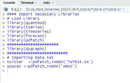
In this tutorial, we will use the stock-adjusted closing prices of SpaceX and Twitter from the Yahoo Finance data server. But to collect the data, we will use the direct data-pulling method in R-Studio with the help of the “pdfetch_YAHOO” function of the “quantmod” library. To import the dataset in the R-studio global environment, you just need to run the following codes in your R-Studio console.
Codes:
#### Import Necessary Libraries
# Load Library
library(quantmod)
library(tseries)
library(timeSeries)
library(forecast)
library(pdfetch)
######################
library(dygraphs)
##########################
# Importing Data set
twitter <- pdfetch_YAHOO(‘TWTR34.SA’)
spaceX <-pdfetch_YAHOO(‘ARKX’)
Step-2
In this step, you will be able to plot the adjusted closing price of Twitter stock price to understand the trend of the price change. As the primary objective of this tutorial is to relate the big announcement effect on stock price therefore you must check the general time series trends first.
Plotting Twitter Stock Price:
###############Piloting Twitter Data###########
chartSeries(twitter, subset = ‘last 10 month’, type = ‘auto’,theme=chartTheme(‘white’))
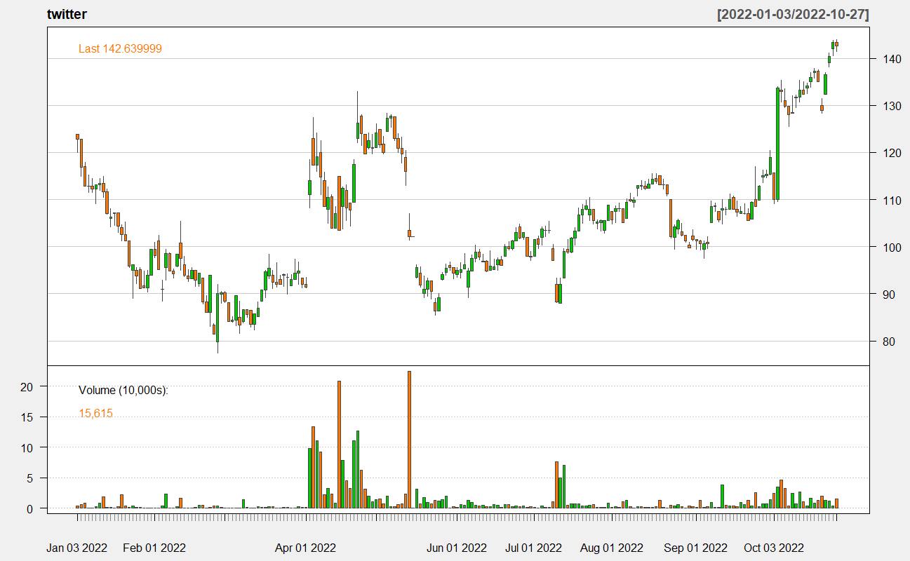
Figure-1: Candle Chart of Twitter Stock Closing Price.
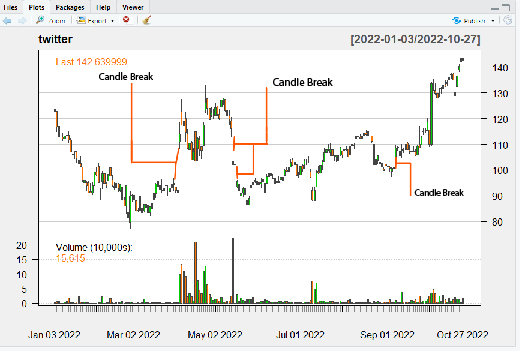
Figure-2: Candle Break or Day of in the Trading.
When you look at the adjusted closing price of Twitter’s stock, you should notice some days where the daily stock price is missing. In the above figure, you can see that it has been marked as “Candle Break.”
Step-3
Now that you have noticed a significant price fall in Twitter stock, you should also check the trends of other stocks that are also owned by Elon Musk. As you know, SpaceX is one of the most prominent organizations founded by Elon Musk. As Elon Musk recently announced to purchase twitter in 14th of April 2022, therefore you should check the stock price trend of SpaceX from April 2022 to onward. So, using the following r codes, you can plot a time series candlestick graph of the adjusted SpaceX closing price in R.
Code:
###############Piloting spaceX Data###########
chartSeries(spaceX, subset = ‘last 10 month’, type = ‘auto’,theme=chartTheme(‘white’))
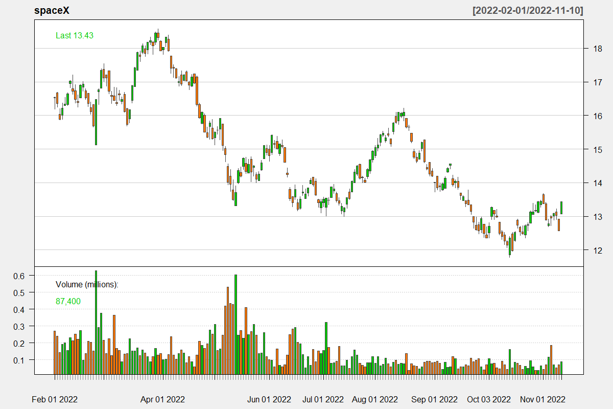
Figure-3: Price Trend of SpaceX Stock Price.
Important Notes:
To perform the above plotting, you must follow the code syntax that was discussed earlier. For example, chartSeries is a function from quantmod therefore, you need to import the library first. Also, you can select a specific date range and different themes using the above function.
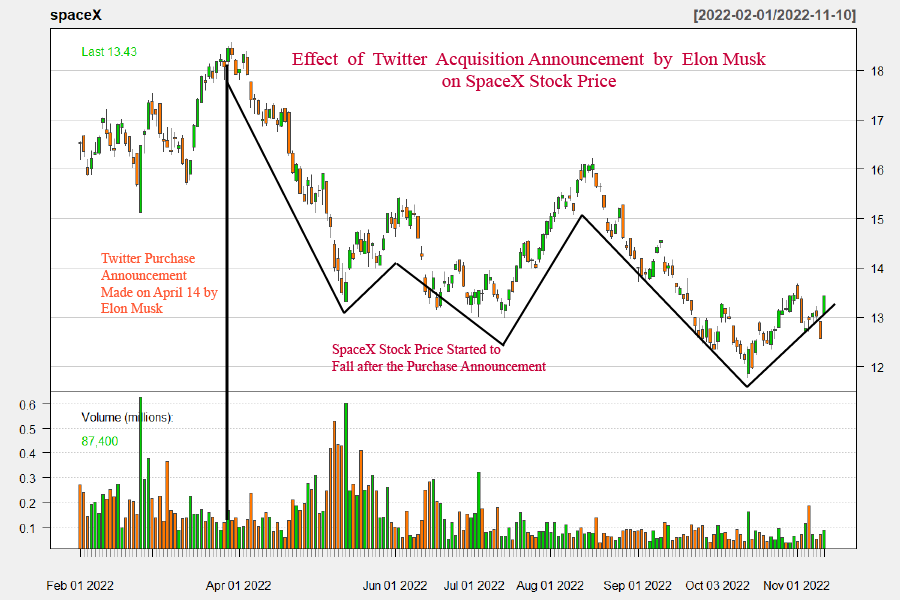
Figure-4: Effect of Twitter Purchase Announcement on SpaceX Stock Price (Hypothetical)
In Figure figure-4 you can see the fall in stock price after the announcement of Twitter’s purchase was published publicly. The fall of stock prices of Twitter and SpaceX may not be entirely affected by the big announcement, but hypothetically, it is one of the reasons. From here on, you will learn how to prepare data to plot an interactive graph using dygraph library.
Step-4
Firstly, import two necessary libraries in R-Studio. You can import the library by typing the following r codes.
## Import the following library.
library(dplyr)
library(tidyverse)
Also note that, if the libraries are not installed in your R-studio then just run the the following r codes in the console to install them manually,
install.packages(‘dplyr’)
install.packages(‘tidyverse’)
Also, there is one thing you should keep in mind that some time after loading libraries in console, you may encounter some warning messages. Besides, when loading libraries, you can also see messages like below,
If you encounter these types of error messages, you can ignore those by just reloading the libraries twice.
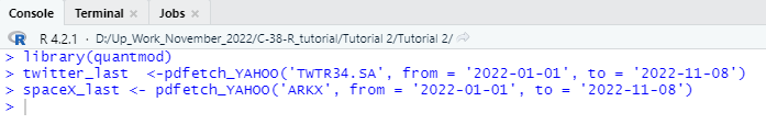
Now, let’s keep the focus on preparing the data for plotting an interactive graph using the dygraph package of the R community. To prepare the data set, you need to load the data set from yahoo finance again like before. But this time you need to specify the date range while pulling the data. You can select the date range by running the following r codes in your R-Studio console.
Code:
library(quantmod)
twitter_last <-pdfetch_YAHOO(‘TWTR34.SA’, from = ‘2022-01-01’, to = ‘2022-11-08’)
spaceX_last <- pdfetch_YAHOO(‘ARKX’, from = ‘2022-01-01’, to = ‘2022-11-08’)
In this section, we have selected Twitter and SpaceX data from 2022-01-01 to 2022-11-08, and you can use a different date range according to your necessity. Now, as the data set has several features and we want to plot the adjusted closing price, you can run the following r code and select the mentioned variables from the data frame.
Code:
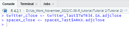
twitter_close <- twitter_last$TWTR34.SA.adjclose
spaceX_close <- spaceX_last$ARKX.adjclose
Step-5
Now we have to convert the adjusted closing price data as a vector as it is in data frame format. You can not put a data frame in the dygraph plotting. Also, the date must be formatted as a time series, and you must specify the frequency and date range. To conduct the following formatting, you need to run the following r code in your console.
Code:
twitter_price <- ts(frequency = 12, start = c(2020, 12), end = c(2022,11),
data = c(twitter_close))
spaceX_price <- ts(frequency = 12, start = c(2020, 12),end = c(2022,11),
data = c(spaceX_close))
Mask <- cbind(twitter_price, spaceX_price)
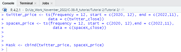
After creating to factors twitter_price and spaceX_price, you need to combine them using the cbind function according the above-mentioned Mask variable.
Step-6
We have prepared our data set and we can now use dygraph package to create a interactive time series line graph. You must call the function dygraph first and inside first double bracket you have to put the variable name Mask. After that you need to write the title of the graph as main=’title’. Right after that you have to use %>% and write dySeries(“spaceX_price”, axis = ‘y2’). If all things are currently applied, you will get an interactive graph like below.
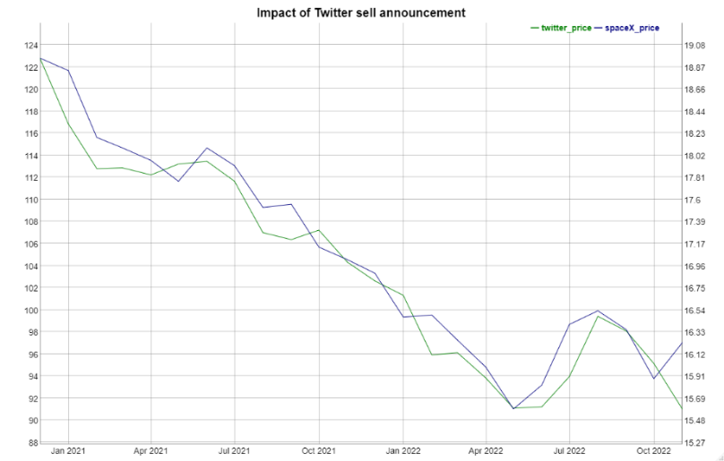
Figure-5: Interactive Graph using dygraph Package.
The dygraph can be improved by adding more features. For example, you can add features like dyRoller. As a consequence, the average of the number of timestamps provided in the roll period will be represented by each depicted point. The following r codes can add the timestamp in the previously plotted dygraph.
Code:
dygraph(Mask, main = “Impact of Twitter sell announcement “) %>%
dySeries(“spaceX_price”, axis = ‘y2’) %>%
dyRoller(rollPeriod = 5)
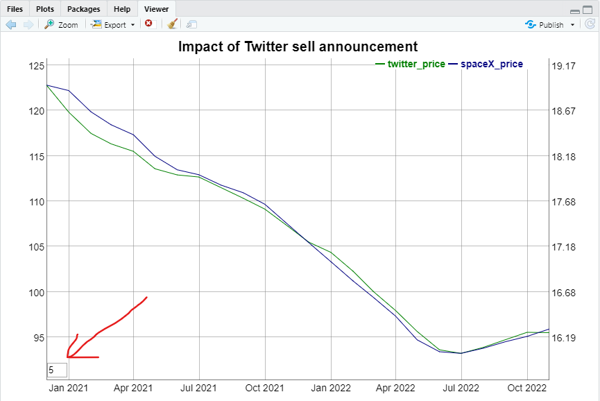
Figure-6: Interactive Graph with roll period of 5.
If you correctly plot the dygraph using the dyroller features then you can see the rolling period at the point indicated by the red coloured arrow line.
Conclusion:
In this tutorial, you have learned very important and useful graphing tools in R-Studio. Throughout the tutorial, we have tried to demonstrate a different graphing technique that you can follow while creating your graph project. The main feature of the dygraph library in data visualization is that it can create interactive time series graphs where you can check data by pointing to your computer’s mouse pointers. Also, the library provides the features to export the graph to PNG or JPG image format. Also, you can export the entire graph as an HTML web page, which you can use on your website as an interactive graph. We have also tried to demonstrate the effect of a big announcement by any company and how it affects the stock price. This article on digraph plotting will help you learn the basic concepts of interactive data visualization, and you will be able to dig deeper into further visualization projects of yours.