Conducting a churn analysis is the process of understanding how many customers your business is losing. This is important because every business owner would know that the cost of marketing needed to bring in new customer is far more than that of keeping the previous ones happy. Moreover, even a small number of customers who stop coming to your business any more can quickly compound to a big loss in your clientage overtime. As a part of customer relationship management (CRM), it is important to perform a churn analysis periodically and tweak your operations accordingly.
In this tutorial I will be explaining how you can perform a churn analysis in R with your customer data. However, before I begin explaining the actual analysis, I would like to go into a bit more detail of what a churn analysis really is. This is important because an analysis by itself would not be of much use if it does not help you correct your business operations. This tutorial aims at giving you a complete insight on how to perform a churn analysis and how to draw conclusions using your results.
What is a Churn Analysis?
As said earlier, churn is the rate at which your business loses customers and a churn analysis is the detailed study of this customer loss. This analysis is useful because losing customers is expensive for businesses and understanding why your business loses customers can help you correct it. There are a number of reasons why churn can occur. Down below, I have listed out some of the most common reasons. It is important to know these because they will help you understand the results of your own analysis better.
Abandoned Subscriptions
Sometimes, your business may have had the wrong kind of customers sign up. i.e., the customers were sold a product that they did not require, or your existing customers might not find what they require “anymore” with their subscription. In either of these cases, such customers are almost always going to churn.
One way to avoid this is to keep upgrading functionality and bringing in new things for your customers in their previous subscriptions. Moreover, it is sometimes also important to go one-on-one with the customers who are drifting away from your product. You could help such customers understand how they can make use of your product.
Switching to Alternatives
It is important to keep a close eye on your competitors and understand how they are operating. If your competitor is bundling in more free resources than you are in a given subscription, or if your competitors are offering more value for the same money, then your customers are highly likely to switch to them.
The thing about this kind (or any kind) of churn is that you don’t precisely know why it’s happening. But analyzing your churn rate and doing something called a backward induction can help you figure out why it’s happening. For example, if you are seeing that your competitor is selling the same packages but advertises them better and gives better customer service, then you may be able to deduce that a fraction of your lost customers is coming from the fact that these customers switch to alternatives.
This kind of churn is generally more problematic because getting these customers to come back to your business can be even more expensive than bringing in new customers.
Customer Relationship
Any successful business should know that keeping your existing customers happy is important for business and this isn’t as easy as it sounds. It can get tricky at times. If your customers feel like they don’t need your product anymore, they will unsubscribe even if they do need your product. It is important to stay active with your customers and show them how they can continue to better their experience of using your subscription. The key is to keep them engaged.
This kind of churn can be the cause for roughly half of the total churn some businesses experience and the customers who unsubscribe because they were dissatisfied rarely subscribe again.
Low Repeat Value
Sometimes, there may be nothing wrong with your product. In fact, your customers would be extremely happy with the services they got from you. But if you lose these customers then it is still churn and it is still expensive for your business. Remember that it is cheaper to bring back customers rather than bringing new customers. But if these customers are happy, then why do they leave?
The answer is simple, your product suffers with low repeat value. A customer may use it once but may not need to use it again. You can fix this by widening your product range. You can add more things to your product list, or you can find other ways to increase the repeat value of your current products.
The Importance of a Churn Analysis
You can’t solve your problems if you can’t identify them. If your business is losing customers, then you can’t solve this problem if you aren’t aware of the fact that your business is suffering because it is losing customers. Moreover, even if you know that your business is losing customers, you can’t solve the problem if you don’t know why you are losing customers.
Churn rate is a very important statistic for your business because if you let your churn rate go up without noticing, eventually it can lead to more severe problems or even business shut down. A churn analysis points out the problems for you giving you a direction for how to solve the churn problem. Moreover, smoothly going about a churn analysis is important because this is not a one-time thing. You need to periodically track your churn as a tool for tracking your performance over time. In an attempt to maximize revenue, churn rate is among the first things you need to bring as low as possible. Getting new customers is important as well but that is wasted investment if the customers you bring in aren’t staying.
Conducting a Churn Analysis Using R
Understanding the Data
Now that you have some basic understanding of what a churn analysis is and why it is important, I can proceed to show how you can conduct one using R. In this tutorial I will be using an IBM Sample Dataset for a telecom firm.
The dataset holds information for roughly 7000 customers in 21 columns. Each column represents a characteristic of the customer. Using the features as outlined in these columns, we will be identifying the customer churn rate and some detailed insights about it.
We’ll first start with loading the dataset into R.
> data = read.csv('path../sample_data.csv')Upon viewing, the first 7 columns of your data should look like this.
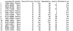
[I’ll now explain what each of these columns mean, this is important for the understanding of what kind of data is helpful in what ways when performing a churn analysis.
Customer ID and gender are fairly straight forward, the column marked ‘SeniorCitizen’ has been filled with 0’s (for no) and 1’s (for yes). ‘Partner’ and ‘Dependents’ tell whether the customer has a partner and dependents or not. ‘tenure’ gives a duration (in months) in which the person was an active customer of the company. ‘PhoneService’ tells whether the customer has subscribed to a phone service and if yes, ‘MultipleLines’ tell whether they use multiple phone lines. ‘InternerService’ tells about the customer’s internet subscription. If they use a subscription, the next few columns give information about the subscription bundle i.e., whether the customer has an online backup, device protection or whether they stream movies etc. ‘Contract’ gives the renewal period of the customer’s subscription. Finally, ‘Churn’ tells whether the customer is still buying or whether they have churned.
Fixing the Data
Before we can properly dive in and begin the analysis, there is one thing that just about any statistician does before using a dataset. It is to check if the dataset it complete and whether the data needs any tweaking to make it fully useful.
You’ll need the following R packages in this tutorial for the analysis and the data cleaning, so I’m listing them out in one place for simplicity. Be sure to install any of these packages before proceeding if you haven’t done that already.
> library(plyr)
> library(corrplot)
> library(gridExtra)
> library(caret)
> library(MASS)
We’ll first use the ‘sapply()’ function to delete the rows which have missing values (detected via complete.cases()).
> sapply(data, function(x) sum(is.na(x)))
> data <- data[complete.cases(data), ]
Now, one more thing you may have noticed is that there are a couple of variables with ‘potentially’ binary labels, i.e., ‘Yes’ and ‘No’. For example, ‘OnlineSecurity’ and ‘OnlineBackup’ are labeled as ‘Yes’, ‘No’ or ‘No Internet Service’. We’ll change the last label to ‘No’ as well to bring to bring uniformity in all 6 columns.
> adjusted_cols <- c(10:15)
> for(i in 1:ncol(data[,adjusted_cols])) {
+     data[,adjusted_cols][,i] <- as.factor(mapvalues
+                                           (data[,adjusted_cols][,i], from =c("No internet service"),to=c("No")))
+ }
Similarly, the ‘MultipleLines’ column is labeled with ‘No Phone Service’ along with ‘Yes’ and ‘No”. We’ll fix that as well.
> data$MultipleLines <- as.factor(mapvalues(data$MultipleLines, from=c("No phone service"), to=c("No")))A final issue with the binary variables is that the ‘SeniorCitizen’ column is labeled with 0’s and 1’s, we’ll change that to ‘Yes’ and ‘No’ for uniformity.
> data$SeniorCitizen <- as.factor(mapvalues(data$SeniorCitizen,from=c("0","1"),to=c("No", "Yes")))Now, one more problem here is that there are 3 columns that hold numerical variables and they do not use the same scale. If your data is not normal, you can simply rescale it, otherwise you have to standardize it first. In our case, however, an easier fix is to divide the ‘tenure’ column into groups sorted by years. We can observe that our data holds customers with a tenure between 1 month and 6 years (72 months). So, we divide them accordingly.
> adjusted_tenures <- function(tenure){
+     if (tenure >= 0 & tenure <= 12){
+         return('0-12 Month')
+     }else if(tenure > 12 & tenure <= 24){
+         return('12-24 Month')
+     }else if (tenure > 24 & tenure <= 48){
+         return('24-48 Month')
+     }else if (tenure > 48 & tenure <=60){
+         return('48-60 Month')
+     }else if (tenure > 60){
+         return('> 60 Month')
+     }
+ }
> data$adjusted_tenures <- sapply(data$tenure, adjusted_tenures)
> data$adjusted_tenures <- as.factor(data$adjusted_tenures)
Using the Data
Creating a Decision Tree
Now comes the fun part, we’ll begin by using a decision tree to analyze the binary variables and how they relate with the churn. It is important to know that a decision tree has two important segments, the leaves and the nodes. The leaves hold a group of keys that represent observations, in our case, ‘Yes’ and ‘No’. Nodes on the other hand represent the variables that define the division of leaves into sub-leaves.
I’ll first split the data into training and testing data. Normally, statisticians normally go with an 80/20 split, but that is up to you and your data.
> split<- createDataPartition(data$Churn,p=0.8,list=FALSE)
> set.seed(2017)
> DTR<- data[split,] #training data
> DTS<- data[-split,] #testing data
With the splits made, we can build a decision tree and plot it.
> decision <- ctree(Churn~Contract+adjusted_tenures+PaperlessBilling, DTR)
> plot(decision)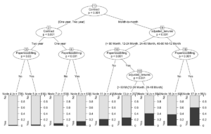
[Here we used three variables, contract, tenures and billing type to find a correlation with the churn, and we can deduce that contract defines the churn most heavily. A customer having a contract of more than a year is less susceptible to churning regardless of the type of billing they use. Conversely, customers with a contract of less than a year are more susceptible to churning.
Testing the Results
The decision tree here is our trained model, we can now use it to make predictions. I’ll first start with a confusion matrix that will give all the true positives, true negatives, false positives and false negatives against the test data.
 > prediction <- predict(decision, DTS)
> print("Confusion Matrix for Testing"); table(Predict = prediction, Real = DTS$Churn)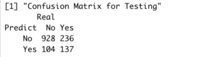
[This doesn’t tell much until we can formally calculate the accuracy of our model.
> a <- predict(decision, DTR)
> table1 <- table(Predict = a, Real = DTR$Churn)
> table2 <- table(Predict = prediction, Actual = DTS$Churn)
> print(paste('Accuracy Results',sum(diag(table2))/sum(table2)))

[1] "Accuracy Results 0.758007117437722"
Our model correctly predicts the probability of a customer churning roughly 76% of the times. If you are new to training and testing such models, let me just point out that this practice is indeed machine learning, where you are teaching your machine to predict information about a customer given some data. If you just learned this, then this might just be your first machine learning model.
There are many other ways to conduct a churn analysis, the ‘RainForest’ package, for instance, gives some very powerful tools to do this as well. R gives us the benefit of doing one job in many different ways and the way I like to put it is to find the simplest way that suffices.