Pie charts are a useful tool in data science. They do an excellent job illustrating the relative percentages of the information in a data set. They are a way of presenting data that is easy for anyone to understand. R has a function that is specifically designed to make good-looking pie charts.
What is a pie chart?
A pie chart is a graphical representation of data as a circle that is cut like a pie. This, of course, is the origin of the name pie chart. Pie charts can present data in several ways, but they all show the relative proportions of the total held by each object. Pie charts are a handy way to illustrate percentages because they easily show how much of the total each object possesses. In most programming languages creating a pie chart would be a challenge but R make it quite easy.
The pie function.
The pie function in R takes the form of pie(x, labels, radius, main, col, clockwise) that produces a pie chart from the values entered.
- x is the vector of the numeric values being used by the pie chart.
- labels is the vector of the labels associated with each value.
- radius is the radius of the pie chart with a value of -1 to 1.
- main is the name of the pie chart.
- col is the color palette being used in a pie chart.
- clockwise is a logical designation indicating the direction of the items in the pie chart.
Applications of the pie function.
The applications to the pie function are as numerous as the applications of pie charts. This includes things such as election results, sales team statistics and much more. The variations in this function allow for considerable customization expanding its usefulness. The pie function is at its best when comparing parts of a group of objects to the whole. A good example is one you are looking to illustrate the percentage of the whole occupied by each part of the group.
A Basic Pie Chart R.
While the most basic possible form of the pie function is simply pie(x) it is also not very useful since people will not know what it means. To get a meaningful pie chart you need at least, the values, labels, and title.
# example - how to make a pie chart in R
> x = c(125, 130, 200, 145, 130)
> labels = c("Bob", "Tim", "Alis", "Jim","Sue")
> pie(x,labels,main="Sales Department pie chart")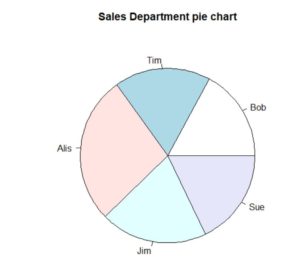
This illustrates a pie chart of the performance of a company sales department. While the setup is good, the color is dull and can be improved on.
Color With Pie Chart R.
Adding a color palette to a pie chart helps to bring it alive. The pie function does have an argument for a color palette, but you need to give it a vector of colors.
The simplest way to add a color palette is with the rainbow function as used in this example. It gives you a pallet for whatever length you need.
# example - how to make a pie chart in R (with color)
> x = c(125, 130, 200, 145, 130)
> labels = c("Bob", "Tim", "Alis", "Jim","Sue")
> pie(x,labels,main="Sales Department pie chart", col = rainbow(length(x)))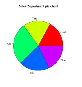
Number Labels With Pie Chart R.
If you wish to show the numbers, then you can simply repeat x in the labels’ position. The result is that the names get replaced by numbers.
To make the chart meaningful, you need to add a legend as shown in the last line of code, so as to associate the colors with the names. Example below:
# how to make a pie chart in R (with numbering)
> x = c(125, 130, 200, 145, 130)
> labels = c("Bob", "Tim", "Alis", "Jim","Sue")
> pie(x,x,main="Sales Department pie chart", col = rainbow(length(x)))
> legend(x=1,y=1, labels, fill = rainbow(length(x)))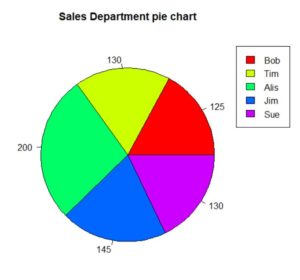
Making a pie chart in R is quite easy because it has a single function to do the job. Most programming languages would require multiple functions and complex graphics calculations to do the job of this one R function.