This article will explore how to conduct a normality test in R. This normality test example includes exploring multiple tests of the assumption of normality.
Normal distribution and why it is important for us
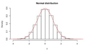
Gaussian or normal distribution (Figure 1) is the most significant distribution in statistics because several natural phenomena (e.g. blood pressure, heights, measurement errors, school grades, residuals of regression) follow it. If phenomena, dataset follow the normal distribution, it is easier to predict with high accuracy. If we would like to use parametric statistical tests (e.g., correlation, regression, t-test, analysis of variance (ANOVA), Pearson’s correlation coefficient), the validity of these test depends on the distribution. Parametric tests are only valid if the distribution is normal/Gaussian, otherwise, we violate the underlying assumption of normality. Normality and other assumptions should take seriously to have reliable and interpretable research and conclusions.
If we found that the distribution of our data is not normal, we have to choose a non-parametric statistical test (e.g. Mann-Whitney test, Spearman’s correlation coefficient) or so-called distribution-free tests.
Possibility of normality tests
There are several possibilities to check normality:
– visual inspections such as normal plots/histograms, Q-Q (quartile-quartile), P-P plots, normal probability (rankit) plot,
– statistical tests such as Sapiro-Wilk, D’Agostino’s K-squared test, Jarque–Bera test, Lilliefors test, Kolmogorov–Smirnov test, Anderson–Darling test.
All the methods have their advantages and disadvantages. In this tutorial, the most widely used methods will be shown, such as normal plots/histograms, Q-Q plots and Sapiro-Wilk method.
3. How to do normality tests in R
I have chosen two datasets to show the difference between a normally distributed sample and a non-normally distributed sample. Datasets are a predefined R dataset: LakeHuron (Level of Lake Huron 1875–1972, annual measurements of the level, in feet). ChickWeight is a dataset of chicken weight from day 0 to day 21.
Histograms and density plots
The histogram or density plot provides a visual judgement about whether the distribution is bell-shaped or not.
# test for normal distribution r - exploratory analysis
hist(LakeHuron, xlim=c(570, 590), xlab='Level of water, feet')
hist(ChickWeight$weight, xlab = 'Chicken weight')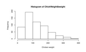
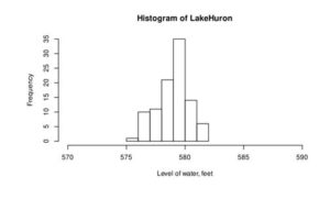
Figure 2: Histogram of the water level of Lake Huron between 1875-1972 (a) and ChickWeight (b)
From this curve, we can assume that the distribution of water level is normal (Figure 2a), but Chicken weight is skewed to right and not normally distributed.
> hist(LakeHuron, xlim=c(570, 590), xlab=’Level of water, feet’, freq = FALSE)
If freq=FALSE parameter is added to this code than density plot is created (Figure 3).
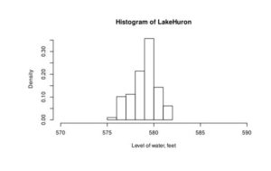
Figure 3. Density histogram of water level
Q-Q plot
Q-Q (or quantile-quantile plot) draws the correlation between a given sample and the normal distribution. A 45-degree reference line is also plotted to help to determine normality.
Here, I show two different methods, the first one is based on base R libraries, the second one uses an outer library.
qqnorm and qqline
# normality test in r
> qqnorm(LakeHuron)
> qqline(LakeHuron, col = "blue")
In this case, we need to run two lines of codes. First, qqnorm(LakeHuron) creates theblack dots, which represents the sample points. The second line – qqline(LakeHuron, col = “blue”) – creates the blue line, which represents the normal distribution.
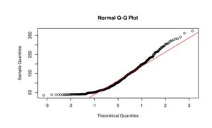
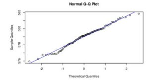
Figure 3. Q-Q plot of LakeHuron dataset (a) and ChickWeight (b)
In the case of LakeHuron dataset, as all the points fall approximately along this reference line, we can assume normality. ChickenWeight dataset points are far from the normal line in both ends of the curve, which means that this dataset is not normal.
Q-Q plot with ggpubr library
The ggpubr library helps to provide publication-ready graphs easily, for more information https://rpkgs.datanovia.com/ggpubr webpage should be visited.
If you never used this library before, you have to install it:
> install.packages(“ggpubr”)
If you have already installed, run the following commands:
> library(“ggpubr”)
> ggqqplot(LakeHuron)
> ggqqplot(ChickWeight$weight)
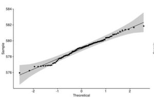
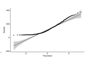
Figure 4. Q-Q plot of LakeHuron dataset (a) and ChickWeight (b) with qqpubr library
This approach gives you more power to visually determine whether the sample distribution is normal because the grey area shows the acceptable deviation from the normal line. This method also assumes that LakeHuron dataset is normally distributed and ChickWeight is not.
Statistical tests
Statistical tests are much more reliable than only visual observations. In case of significance tests sample distribution is compared the normal distribution. The null hypothesis of these tests is the sample distribution is normal. If we fail to reject the null hypothesis, the sample is normal. If the test is significant/we reject the null hypothesis, the sample distribution is non-normal.
Sapiro-Wilk test
The Sapiro-Wilk method is widely used to check normality. It is not so sensitive to duplicate data then Kolmogorov–Smirnov test.
> shapiro.test(LakeHuron)
Shapiro-Wilk normality test in R
data: LakeHuron
W = 0.98492, p-value = 0.3271
From the output, the p-value > 0.05 shows that we fail to reject the null hypothesis, which means the distribution of our data is not significantly different from the normal distribution. In other, words distribution of our data is normal.
> shapiro.test(ChickWeight$weight)
Shapiro-Wilk normality test in R
data: ChickWeight$weight
W = 0.90866, p-value < 2.2e-16
Since the shapiro wilk test p-value is << 0.05 that we can conclude that we can reject the null hypothesis, which means that our distribution is not normal.
In large sample size, Sapiro-Wilk method becomes sensitive to even a small deviation from normality, and in case of small sample size it is not enough sensitive, so the best approach is to combine visual observations and statistical test to ensure normality.
More advanced possibilities
The nortest package provides five more normality test such as Lilliefors (Kolmogorov-Smirnov) test for normality, Anderson-Darling test for normality, Pearson chi-square test for normality, Cramer-von Mises test for normality, Shapiro-Francia test for normality.
> nortest::ad.test(LakeHuron)
Anderson-Darling normality test
data: LakeHuron
A = 0.43831, p-value = 0.2888
> nortest::cvm.test(LakeHuron)
Cramer-von Mises normality test
data: LakeHuron
W = 0.066322, p-value = 0.3093
> nortest::lillie.test(LakeHuron)
Lilliefors (Kolmogorov-Smirnov) normality test
data: LakeHuron
D = 0.070193, p-value = 0.2757
> nortest::pearson.test(LakeHuron)
Pearson chi-square normality test
data: LakeHuron
P = 11.041, p-value = 0.3543
> nortest::sf.test(LakeHuron)
Shapiro-Francia normality test
data: LakeHuron
W = 0.9883, p-value = 0.4635
All of the advanced tests are supported that we fail to reject the null hypothesis, so the water level of Lake Huron is normally distributed.
Dr. Ajna Toth is an Environmental Engineer and she has a PhD in Chemical Sciences. She is an enthusiastic R and Python developer in the field of data analysis. She is a mother of three ever-moving boys. Visit her LinkedIn profile.
https://www.linkedin.com/in/ajna-t%C3%B3th/