Plotting data is something statisticians and researchers do a little too often when working in their fields. If you plan on joining a line of work even remotely related to these, you will have to plot data at some point.
You can easily explore categorical data using R through graphing functions in the Base R setup. This tutorial covers barplots, boxplots, mosic plots, and other views.
What is Categorical Data?
Categorical data is the kind of data that is segregated into groups and topics when being collected. It gives the count or occurrence of a certain event happening as opposed quantitative data that gives a numerical observation for variables.
A frequency table, also called a contingency table, is often used to organize categorical data in a compact form. You can see an example of categorical data in a contingency table down below. It gives the frequency count of individuals who were given either proper treatment or a placebo with the corresponding changes in their health.

[You can read more about contingency tables here.
Running tests on categorical data can help statisticians make important deductions from an experiment. The Chi Square Test , for instance, can be conducted on categorical data to understand if the variables are correlated in any manner.
Now that you know what exactly categorical data is and why it’s needed, I will go on to show you how you can work with categorical data in R.
Plotting Categorical Data in R
R comes with a bunch of tools that you can use to plot categorical data. We will cover some of the most widely used techniques in this tutorial.
Bar Plots
For bar plots, I’ll use a built-in dataset of R, called “chickwts”, it shows the weight of chicks against the type of feed that they took.
We’ll first start by loading the dataset in R. Although this isn’t always required (data persists in the R environment), it is generally good coding practice to load data for use.
# Load Data for Categorical Data in R examples
> require(datasets)
> data(chickwts)
I’ll first start with a basic XY plot, it uses a bar chart to show the count of the variables grouped into relevant categories. You can do that using the “plot()” function.
# visualizing categorical data r - plot example
> plot(chickwts$feed)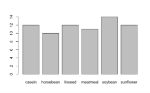
[A similar result can be obtained using the “barplot()” function. However, the “barplot()” function requires arguments in a more refined way. While the “plot()” function can take raw data as input, the “barplot()” function accepts summary tables. In R, you can create a summary table from the raw dataset and plug it into the “barplot()” function. In the code below, the variable “x” stores the data as a summary table and serves as an argument for the “barplot()” function.
# example - Barplot in R
> x <- table(chickwts$feed)
> barplot(x)
The point of using a “barplot()” function is that it allows you to easily manipulate the plot in terms of categories and order. I can, for instance, obtain the bar plot in a decreasing order of frequency.
# example - barplot in R
> barplot(x[order(x, decreasing = TRUE)])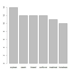
A bar plot is also widely used because it not only gives an estimate of the frequency of the variables, but also helps understand one category relative to another. In the last bar plot, you can see that the highest number of chicks are being fed the soybeans feed whereas the lowest number of chicks are fed the horsebean feed. This may seem trivial for now, but when working with larger datasets this information can’t be observed from data presented in tabular form, you need such tools to understand your data better.
Box Plots
Another very commonly used visualization tool for categorical data is the box plot. A box plot extends over the interquartile range of a dataset i.e., the central 50% of the observations. A dark line appears somewhere between the box which represents the median, the point that lies exactly in the middle of the dataset. Outside the box lie the whiskers, these are basically the ranges that are 1.5 times the IQR above and below the two central quartiles of the data.
What’s important in a box plot is that it allows you to spot the outliers as well. Any data values that lie outside the whiskers are considered as outliers. You can read more about them here.
In R, you can obtain a box plot using the following code. As an example, I’ve used the built-in dataset of R, “Arthritis”.
# Categorical data in R - Boxplot Example
> data(Arthritis)
> boxplot(Arthritis)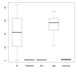
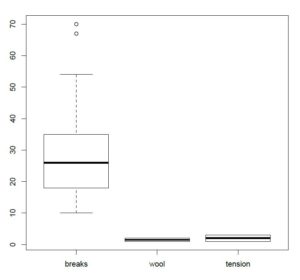
A very important thing to notice here is that the box plot for ID shows that the IQR lies between roughly 20 and 60 whereas that for Age shows that the IQR lies between roughly 45 and 60. Box plots make it easy for you to visualize the relative density of categories on the y-axis. Moreover, you can see that there are no outliers in this dataset. I have attached another boxplot for the built-in dataset “warpbreaks” that shows two outliers in the “breaks” column.
Mosaic Plot
Up till now, you’ve seen a number of visualization tools for datasets that have two categorical variables, however, when you’re working with a dataset with more categorical variables, the mosaic plot does the job.
For a mosaic plot, I have used a built-in dataset of R called “HairEyeColor”. It shows data for hair and eye color categorized into males and females.
You can use the following code to obtain a mosaic plot for the dataset.
# plotting categorical data - mosaic plots
> library(vcd)
> data(HairEyeColor)
> mosaic(HairEyeColor, shade = TRUE)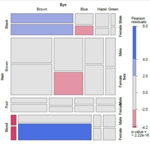
In a mosaic plot, the box sizes are proportional to the frequency count of each variable and studying the relative sizes helps you in two ways.
- It helps you estimate the relative occurrence of each variable.
- It helps you estimate the correlation between the variables.
In the plot, you can see a Pearson’s Residual value that is extremely small. In general, a “p” value that is smaller than 0.05 indicates that there is a strong correlation between the variables.
Conclusion
R offers you a great number of methods to visualize and explore categorical variables. This tutorial aimed at giving you an insight on some of the most widely used and most important visualization techniques for categorical data. This list of methods is by no means exhaustive and I encourage you to explore deeper for more methods that can fit a particular situation better. (Second tutorial on this topic is located here)
Going Deeper…
Interested in Learning More About Categorical Data Analysis in R? Check Out
Graphics
Tutorials
- How To Create a Contingency Table in R
- How To Generate Descriptive Statistics in R
- How To Create a Histogram in R
- How To Run A Chi Square Test in R (earlier article)
The Author:
Syed Abdul Hadi is an aspiring undergrad with a keen interest in data analytics using mathematical models and data processing software. His expertise lies in predictive analysis and interactive visualization techniques. Reading, travelling and horse back riding are among his downtime activities. Visit him on LinkedIn for updates on his work.