Frequency tables are used by statisticians to study categorical data, counting how often a variable appears in their data set. These are a common way to summarize categorical data in statistics, and R provides a powerful set of tools to create and analyze them. Whether you’re working with survey data, market research, or social sciences, frequency tables can help you understand the distribution and patterns of categorical variables. In this article, we’ll explore how to create frequency tables in R using both base R functions and the tidyverse packages. We’ll cover the basic concepts of frequency tables, such as counts, percentages, and cumulative frequencies, as well as some advanced techniques for visualizing and analyzing categorical data. By the end of this guide, you’ll have a solid understanding of how to create and interpret frequency tables in R, and how to apply them to your own data analysis projects.
There are several easy ways to create an R frequency table, ranging from using the factor () and R table () functions in Base R to specific packages. Each different R function for creating a good data table output has its own benefits, from creating a column header and row names to column index, table command, character vector support, being able to import a data file, or multiple columns, but many need a specific R package to properly show you how to make a table in R code. Good packages for creating frequency tables in R include ggmodels, dplyr, and epiDisplay.
In this tutorial, I will be going over some techniques of generating frequency tables using R. I’ll be using a built-in data set of R called “mtcars”. It contains information about the mileage, number of forward gears, number of carburetors and cylinders for various cars.
You can load the data set into your environment using the data() function. This isn’t always needed but is good practice to keep things organized in your code.
> data(mtcars)Generating a Frequency Table in R
The most common and straight forward method of generating a frequency table in R is through the use of the table function. In this tutorial, I will be categorizing cars in my data set according to their number of cylinders. I’ll start by checking the range of the number of cylinders present in the cars.
# factor in R
> factor(mtcars$cyl)
This quickly tells me that the cars in my data set have 4, 6 or 8 cylinders. I can now use the table() function to see how many cars fall in each category of the number of cylinders.
# table in r - how to create a frequency table in R
> table(mtcars$cyl)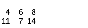
This tells me that 11 cars have 4, 7 cars have 6 and 14 cars have 8 cylinders. However, something you may have noticed here is that this is a very non explanatory table and isn’t the best representation of categorical variables. Moreover, the table is not stored as a data frame and this makes further analysis and manipulation quite difficult. You could always find a way around it, but I usually think of table generation as a quick process and you shouldn’t have to spend too long making your table look better. One alternative is to use the count() function that comes as a part of the “plyr” package. If you haven’t installed it already, you can do that using the code below.
Once installed, you can load it and start using it.
# dplyr frequency table
> install.packages('plyr')
> library('plyr')
> count(mtcars, 'cyl') 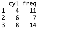
This table is a little more explanatory with the columns and rows labeled. This table includes distinct values, making creating a frequency count or relative frequency table fairly easy, but this can also work with a categorical variable instead of a numeric variable- think pie chart or histogram.
Generating a More Refined Frequency Table in R
The number of ways through which you can perform a simple task in R is exhaustive and each method has its own pros and cons. Similarly, a two way frequency table can be generated using numerous functions, however, one other function that I’ll be going over in this tutorial comes in the “epiDisplay” package. It gives you a highly featured report of your dataset that includes descriptive statistics functions like absolute frequency, cumulative frequencies and proportions. If, for instance, you wish to know what percentage of cars have 8 cylinders or what fraction of cars have 4 gears, this method allows you to get your answer using the same report.
One more thing you may have noticed in the earlier method was that if your data misses some labels for some of the observations, it doesn’t tell you there’s missing values. The “epiDisplay” package, however, tells you exactly how many data points are missing values and even gives you the remaining stats of your data with and without including the missing data points. Here my dataset does not have missing labels therefore, it doesn’t change much but it is an important feature of the function.
# how to make frequency table in r (nicer version)
> install.packages('epiDisplay')
> library(epiDisplay)
> tab1(mtcars$cyl, sort.group = "decreasing", cum.percent = TRUE)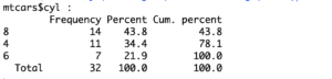
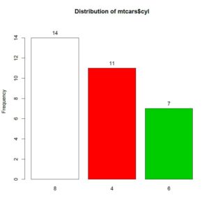
The tab1() function also prints a bar chart to show relative frequencies by default.
Cross Tabulation Using ‘gmodels’
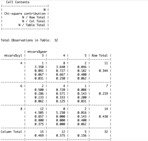
Up till now, we have talked about frequency (or the count of appearance) of one variable in a data set, but for data analysts, an important task would be to generate a frequency with 2, 3 or even more variables. Such a table is also called a Cross Table or a Contingency Table. When talking about a two way frequency table, I find it important to extend the discussion to tables with higher numeric variable numbers as well.
If I talk about the data frame that I am using in this tutorial, suppose I want to know how many cars use a combination of 4 cylinders and 5 forward gears. One way would be to do this manually using two different frequency tables, but that method is quite inefficient especially if my data set had more variables.
Another method is to use the CrossTable() function from the ‘gmodels’ package. It not only gives me a cumulative frequency count but also the proportions and the chi square test contribution of each category.
# CrossTable in R
> CrossTable(mtcars$cyl, mtcars$gear, prop.t=TRUE, prop.r=TRUE, prop.c=TRUE)
I have added the ‘prop.r’ and the ‘prop.c’ parameters and set them to TRUE here. This is optional but when specified, it gives me the row percentages and the column percentages for each category. Moreover, ‘prop.t’ gives me a table percentage as well. This information is particularly useful when you want to compare one variable with another, tabulate other numeric vector actions, or find something like the phi coefficient of a data value .
Getting the frequency count is among the very first and most basic steps of data analysis. It will help you learn other actions in descriptive statistics, such as cross tabulation, finding the mean or the standard deviation, or creating a box plot, bar graph, or histogram. Although R gives you many different ways to get the actual and expected frequency of variables in your data set, I normally find it helpful to get acquainted with a number of methods instead of just one or two. This is because the type of table you need to generate depends largely on what you want to achieve from your data. If you are interested in getting ahead in the field of data analysis, I encourage you to do your research and read the documentation of R on packages such as ‘gmodels’ and functions such as table().
Going Deeper…
Interested in Learning More About Categorical Data Analysis in R? Check Out
Graphics
Tutorials
- How To Create a Contingency Table in R
- How To Generate Descriptive Statistics in R
- How To Create a Histogram in R
- How To Create a Side-By-Side Boxplot in R
- How To Run A Chi Square Test in R (earlier article)
The Author:
Syed Abdul Hadi is an aspiring undergrad with a keen interest in data analytics using mathematical models and data processing software. His expertise lies in predictive analysis and interactive visualization techniques. Reading, travelling and horse back riding are among his downtime activities. Visit him on LinkedIn for updates on his work.