Comparing data is an important part of data science. The QQ plot is an excellent way of making and showing such comparisons. These comparisons are usually made to look for relationships between data sets and comparing a real data set to a mathematical model of the system being studied. This type of probability plot is great for testing sample data, residuals, finding a theoretical quantile, or finding a specific data point. We’re going to share how to make a qq plot in r.
What is a QQ plot?
A QQ plot; also called a Quantile Quantile plot; is a scatter plot that compares two sets of data. A common use of QQ plots is checking the normality of data. This is considered a normal qq plot, and resembles a standard normal distribution through the reference line and value distribution. However, they can be used to compare real-world data to any theoretical data set to test the validity of the theory, including a uniform distribution, confidence intervals, sample quantiles, an exponential distribution, or a cumulative distribution function. They can actually be used for comparing any two data sets to check for a relationship. It works by plotting the data from each data set on a different axis. If the distribution of the data is the same, the result will be a straight line. Each data value of the dataset is plotted along this reference line using the scale parameter, though a general qq plot differs from a histogram figure in that it moves along both the horizontal and vertical axis, and can be used with any common distribution, sample size, empirical quantile, plot type, numeric vector, or linear model to create order statistics such as standard deviation, ylim, and linear regression.
The qqplot function in R.
The qqplot function is in the form of qqplot(x, y, xlab, ylab, main) and produces a QQ plot based on the parameters entered into the function. It will create a qq plot.
- x is the vector representing the first data set.
- y is the vector representing the second data set.
- xlab is the label applied to the x-axis.
- ylab is the label applied to the Y-axis.
- main is the name of the Q Q plot.
How To Make A QQ Plot in R
The qqplot function has three main applications. If you already know what the theoretical distribution the data should have, then you can use the qqplot function to check the validity of the data. The second application is testing the validity of a theoretical distribution. Testing a theoretical distribution against many sets of real data to confirm its validity is how we see if the theoretical distribution can be trusted to check the validity of later data. The third application is comparing two data sets to see if there is a relationship, which can often lead to producing a theoretical distribution.
Basic QQ plot in R.
The simplest example of the qqplot function in R in action is simply applying two random number distributions to it as the data. This example simply requires two randomly generated vectors to be applied to the qqplot function as X and Y.
In this case, because both vectors use a normal distribution, they will make a good illustration of how this function works.
# how to make a QQ plot in R
x = rnorm(100, 50, 25)
y = rnorm(100, 50, 25)

# qqplot function in r package
qqplot(x, y, xlab = "test x", ylab = "test y", main = "Q-Q Plot")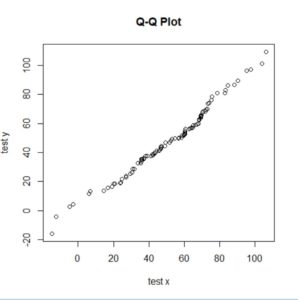
Now that we’ve shown you how to how to make a qq plot in r, admittedly, a rather basic version, we’re going to cover how to add nice visual features. Because, you know, users like this sort of stuff…
U.S urban population by state QQ plot in R.
Here is an example comparing real-world data with a normal distribution. In this case, it is the urban population figures for each state in the United States.
# normal QQ plot in R - normal quantile plot
x = rnorm(50, 50, 20)
y = USArrests$UrbanPop
# normal QQ plot in R
qqplot(x, y, xlab = "Normal Distribution", ylab = "Urban Population", main = "Q-Q Plot")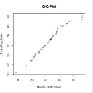
The result of applying the qqplot function to this data shows that urban populations in the United States have a nearly normal distribution. This illustrates the degree of balance in state populations that keeps a small number of states from running the federal government.
U.S assaults vs. population by state QQ plot in R.
In this example, we are comparing two sets of real-world data. In this case, we are comparing United States urban population and assault arrest statistics by states with the intent of seeing if there is any relationship between them.
# how to use qqplot in R
x = USArrests$Assault
y = USArrests$UrbanPop
qqplot(x, y, xlab = "Assaults", ylab = "Urban Population", main = "Q-Q Plot")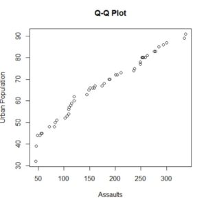
The results show a definite correlation between an increase in the urban population and an increase in the number of arrests for assault. This is an example of what can be learned by the application of the qqplot function.
Q-Q plots are a useful tool for comparing data. For most programming languages producing them requires a lot of code for both calculation and graphing. R, on the other hand, has one simple function that does it all, a simple tool for making qq-plots in R .
Topic: how to make a QQ plot in r